The most recent Microsoft Build conference happened a few days ago and to be honest, we were waiting for this day ever since we realised Windows 8 is not yet done amazing us. We’re quite predictable, unlike Microsoft of course, that way and we can’t wait to see what they have in store for us next. Windows 8.1 preview has been made publicly available and after a day of using it we love it more than would to have a stable internet connection; seriously, this post should have been up days ago.
Of course, we did try an unfinished preview of Windows 8.1, then known as “Blue”, a while back, and discovered great new changes we could expect in the final release. As of now, there is a version of Blue just legal enough to use as a consumer. Let’s just get to it…
Booting into Windows 8.1

We decided to set it up using the ISO instead of upgrading our current installs. It might just be the excitement of trying Windows 8.1 first hand, but we did notice improvements in the installation speed.
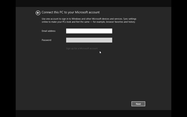
We completed our account setup. There is a greater degree of control in personalisation.
Newer Start screen elements
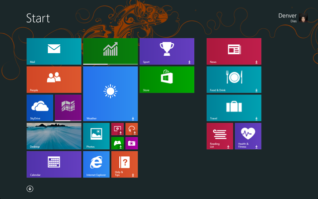
Okay! So, the first thing I’d do is resize and rearrange the tiles. This is just the preview so I’ll let it pass, but I hope the final release sets my tile sizes right on setup.
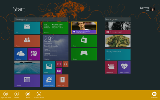
Customising the Start screen is nicer in Windows 8.1, in that all you do is right click on any tile once and it stays in customisation mode until clicked elsewhere. Oh! And right click is now easier – done using tap and hold. The new double height and quarter square tile sizes, we saw earlier, seems to be applied to more apps than we knew they’ll be available for. In addition to Desktop, double height tiles are available for Weather, Music, Video, Pictures and maybe more – I didn’t try them all. Multiple selections can be made on the Start screen now and tile size customisations can be applied in bulk – they won’t grow or shrink more than they can. Note that each group of tiles can be named right here instead of doing it after a semantic zoom.
With Windows 8.1, I can finally go all Windows Phoney.
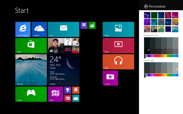
Now while there are a lot of personalisation options to choose from, Windows 8.1 lets one use the background for desktop as the background for the start screen. Switching between desktop and start screen mode is seamless that way.
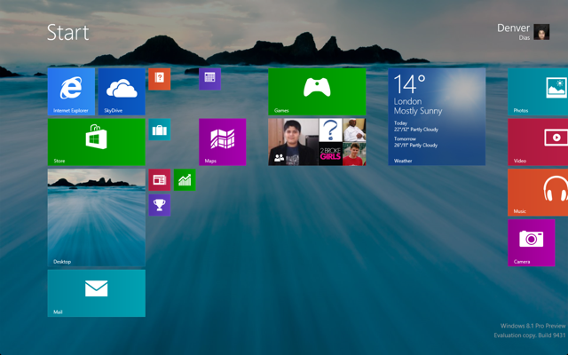
Now for something I wasn’t thrilled about when I heard of it, the Start button is back. And it’s good, it’s better this way.
Desktop mode
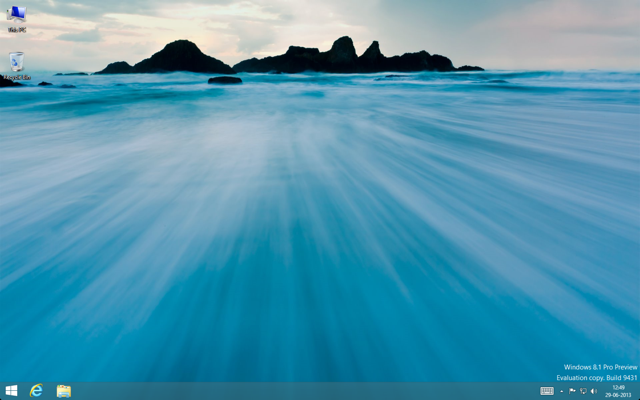
What was once My Computer, and most recently, Computer, is now “This PC”. I don’t think it changes anything but I’m guessing there will be a few users fixating on the trivial.
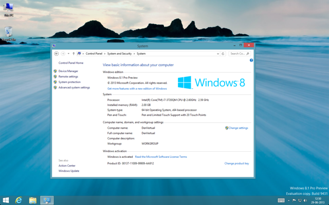
So, the preview built of the next Windows is numbered [6.3.9431]; which appears more of a major release – something they never did before with Windows. Microsoft seems to be sweeping through build numbers rapidly. That seems like a good sign.
Further customisation
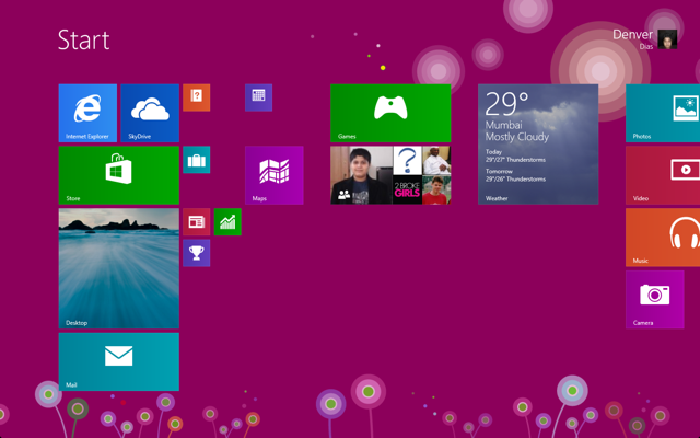
In my earlier encounters with Blue, I did find weird bugs in the tiling system and that appears to have gone unchecked. Of course, they’ve got a lot on their plate so I’ll sit this one out. Still, with a little work I managed to do this. Can you?
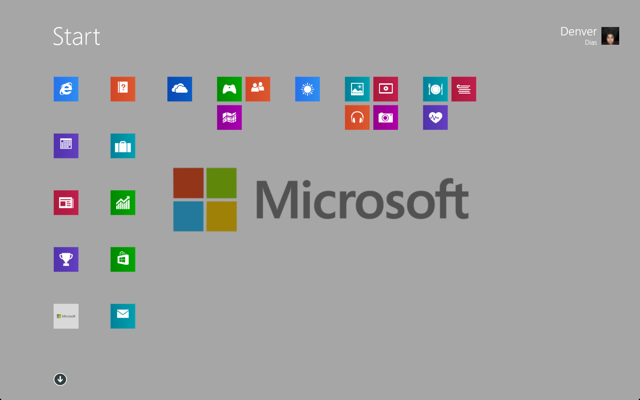
Windows 8.1 on touch
Of course, that is not all we did this time. We tried the new features of Windows in touch mode too. Turns out, touch is where Windows 8.1 gets Windows Phonier.
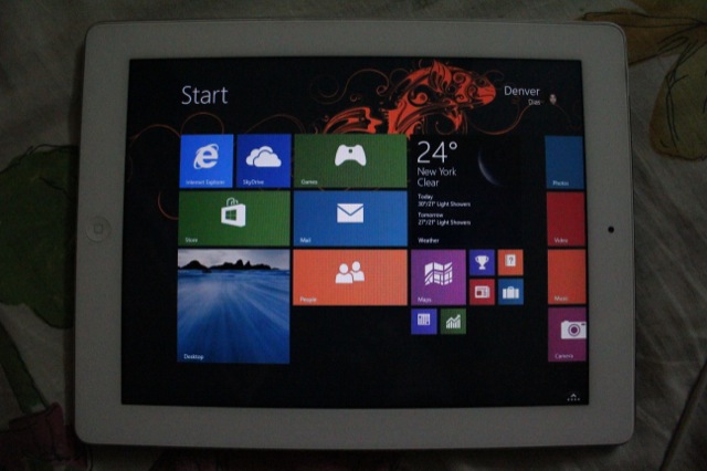
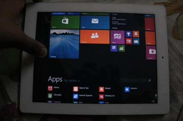
It is nice to finally be able to use a Windows tablet like I did Windows Phone. The all apps list now can be visited by just swiping upward from anywhere on the start screen.
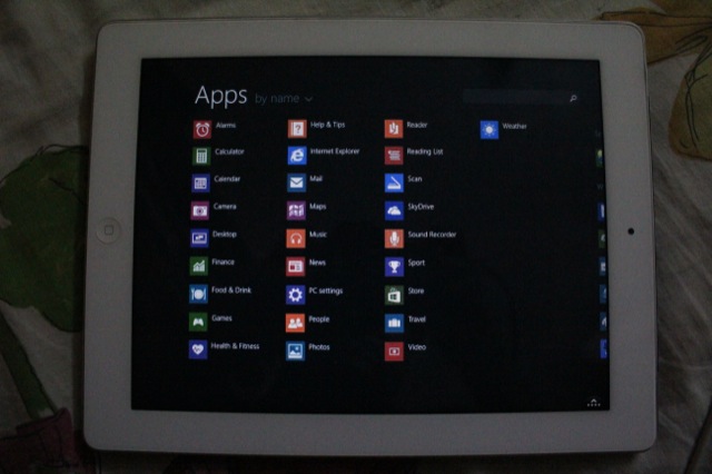
Now let’s talk about some apps.
App improvements
The Store
The Windows Store has undergone a major transformation. It is more personal now with its “Picks for you” selection and its list of Top Apps.
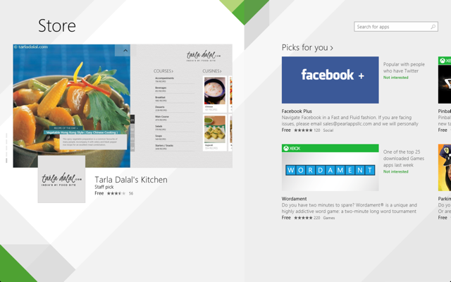
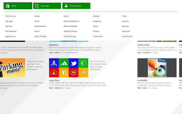
So, what happens to the app listing based on genre? It is still there except you invoke it with a swipe from top or with a right click.
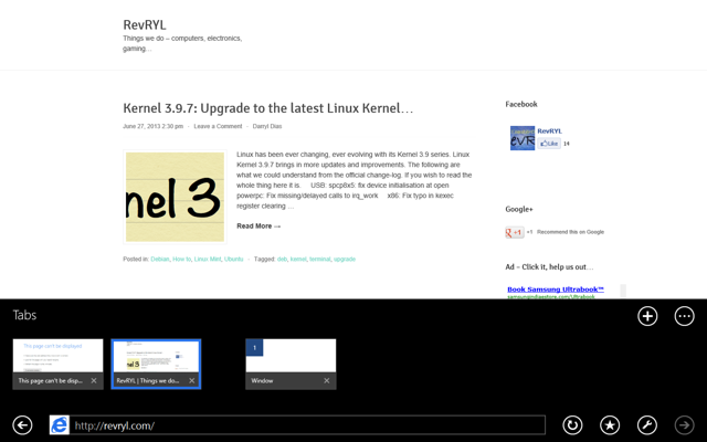
Now, what you see next is an app – a chrome-less one. That’s our site on the improved Internet Explorer. Its scrolling and zooming fluidity have improved and we’re glad to see improvements on the desktop IE too, even though we’re not going very deep into it.
Internet Explorer
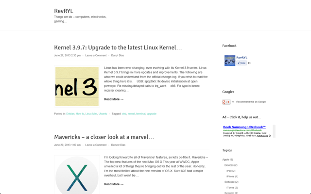
Internet Explorer for Windows 8.1 has changed its tabbing system to now display tabs on the bottom of the screen, just above the address bar.
Now, that is not where the improvements with IE end. We’ve now got the ability to have more than one Internet Explorer windows open.
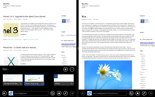
Let’s investigate running multiple apps in Windows 8.1 now.
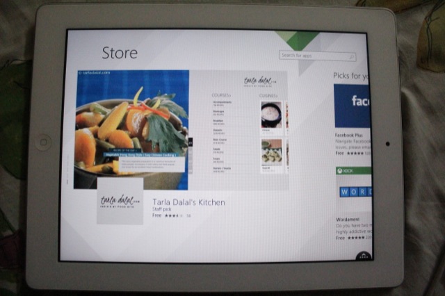
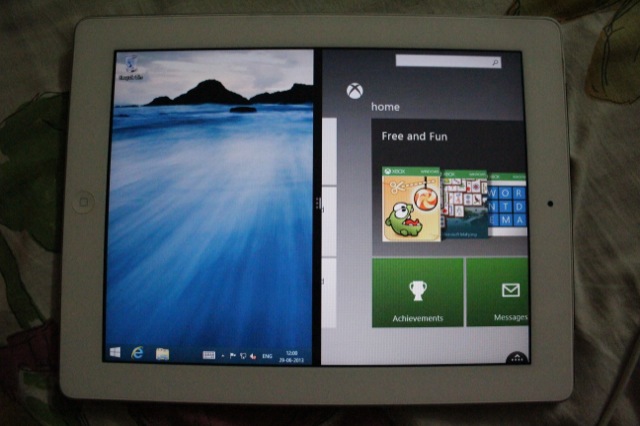
As it turns out, even at the lowest resolution, Windows now allows two side-by-side apps. That’s by default. The app wouldn’t go to it’s side snapped view.
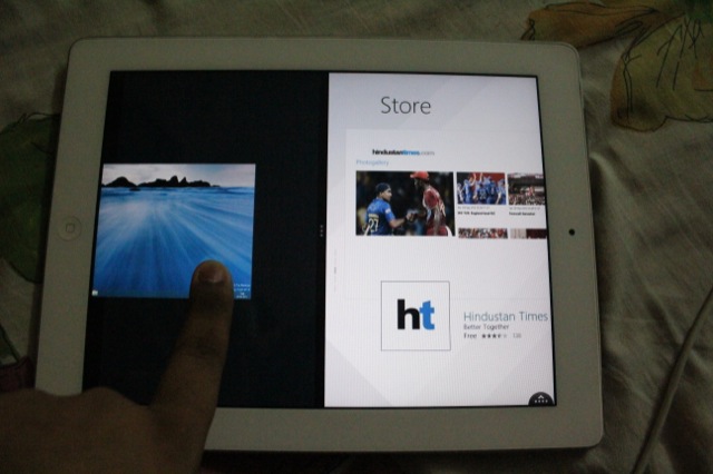
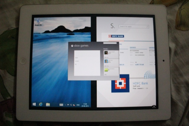
Now, once both apps snap, I wonder which app gets replaced if I open a third app.
Touch Keyboard enhancements
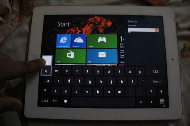
If we just continue on with touch for a while, we discover that the keyboard has improved since Windows 8.
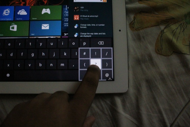
In addition the most used punctuations other than the period, apostrophe and the comma can be quickly obtained by holding the question mark key and sliding to the right punctuation.
Now, let’s increase the resolution.
Multiple apps
As we go higher, we discovered that a greater number of apps can be added. However, none of them enter their snapped view now. Its like snapped view has been abandoned for good – there was not much that could be done.
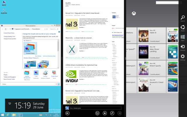
As it turns out, the Charms will be closer to the corner you use to invoke it.
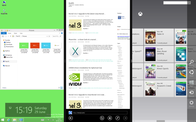
App switching
I’ve chosen to open up the Windows 8 control panel. It, yet again, prompts to choose the window to be replaced.
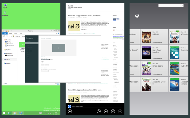
If we increase the resolution even further, we can accommodate a maximum of 4 apps. We believe 4 apps per screen is the limit on Windows 8.1.
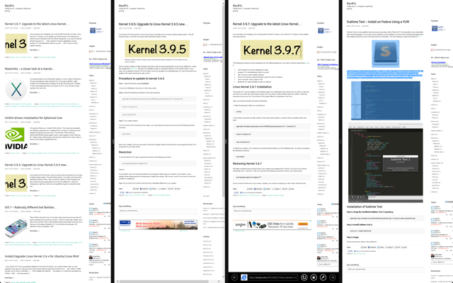
If I double tap any of the separators, all apps revert to equal widths. With 4 separate apps on, it appears that there is a snapped view for apps except it retains full functionality.
Switching adjustments
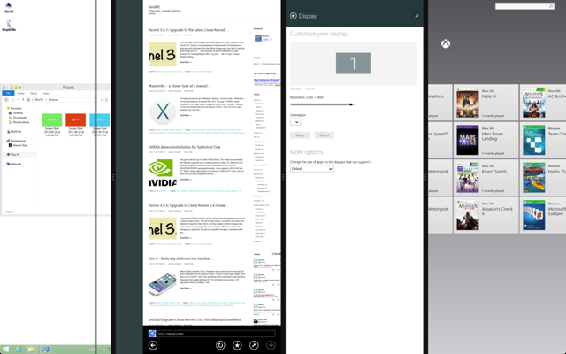
Every app has their own minimum width and can only be shrunk down that far before it is knocked off the screen.
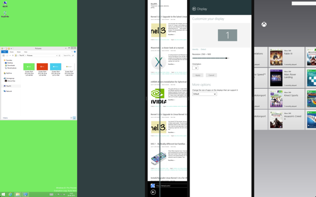
It is clearly visible that space is available for more than 4 apps.
Of course, I totally understand the limit. They’ve done it because nobody can actually take advantage of snapped view of apps and would occasionally extend the app they wish to focus on.
One suggestion
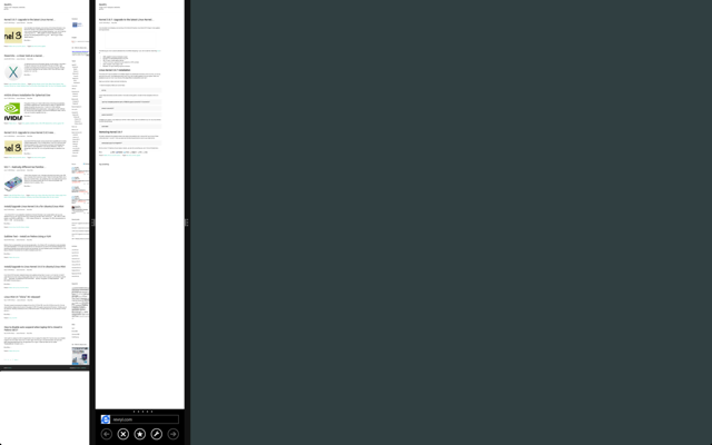
Well, that was our screenshot-evidence supported first impression. All those who’ve tried it, let us know anything and whatever you’ve come across. This is not the end of discussion on Blue yet. We’d bring in more info as it arrives.

