Not many of you know this – and why should you? – but Windows is about to get a whole lot better. Microsoft has done an awesome job, bringing to us a whole new perspective on Windows in its most recent OS – Windows 8. It’s been over 4 months since its release, but it continues to overwhelm me to this date. Updates to this OS has been an almost daily thing with the malware definitions more frequent than the rest, but there is one to come that would begin to change it all. To be honest, I’m fascinated by the weirdest of things. An in-built Windows Defender is what made me decide to upgrade to 8 the minute it was released.
The most brilliant thing Microsoft is up to right now, is unifying all of their system software so that they pretty much run the same regardless of the form factor. The first thing they did with Windows 8 was make it available on ARM – a speedily growing processor architecture that bridges the gap between high level developer electronics and computing. To simplify that, with some minor adjustments the complete OS can pretty much run on your smartphone without issues. Windows Phone shares the Windows 8 style UI feature and the programming of apps is pretty much done in the same way for both. In fact, changing a few lines of code can make a Windows Phone app run on Windows 8.
However, from what has recently been revealed, Microsoft wishes to take that one notch further. There is a possibility that the Windows OS for full size desktops and smartphones would merge in the future, making it so that one device would suffice per person when it comes to the essentials of one’s digital presence. Wouldn’t it be nice to have a peek at what that would be like?
Luckily, I have, and honestly, I’m actually looking up words I could use to continue writing/typing this(with Bing, of course). Its called Blue – well, that’s a code-name for now. Obviously the Windows Phone version of the update will be called Windows Phone Blue, but there has not been much word on that; you can take my word for it…
For now, let’s focus on Windows Blue. It seems to be an upgrade to what we now call Windows 8. Still, I can’t be completely sure about that. Windows 8 was released with the version number [6.2.9200]. However, this thing that seems to be Blue is still labeled Windows 8 and numbered [6.3.9364]. Historically speaking, it is not a free upgrade – well, not for regular Windows 8 or Windows 8 Pro users on Intel computers. On the other hand Surface and other Windows RT tablets might have a chance to free upgrade to this new OS as the former seems to be supported till the year 2017.
A 32-bit version build of this “new OS” with build number 9364 was leaked to the internet a couple of days ago and there have been many video demos and findings posted by vlogging novices and experienced reviewers from technology sites like Engadget and TheVerge. So, I feel quite confident I won’t be facing any consequences from anything I do that’s against the license agreement of which I’m sure there are plenty. If Microsoft is reading this, please avoid any urge to prosecute me – I’ll have you know, I’m pretty certain I’m the only person who pays for full versions of apps in the whole of India.
Starting with installation,
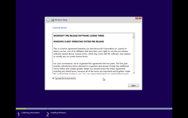
all I see here is that the software is labeled “Pre release”. It is still too soon to tell if we should have waited another year to get that computer.
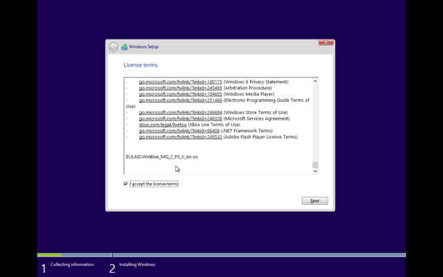
To be honest, this must be the first time on record someone has actually taken the trouble to scroll all the way down before clicking Next.
It went through its usual routine of installing drivers, and getting the system ready. Then it was time to log in.
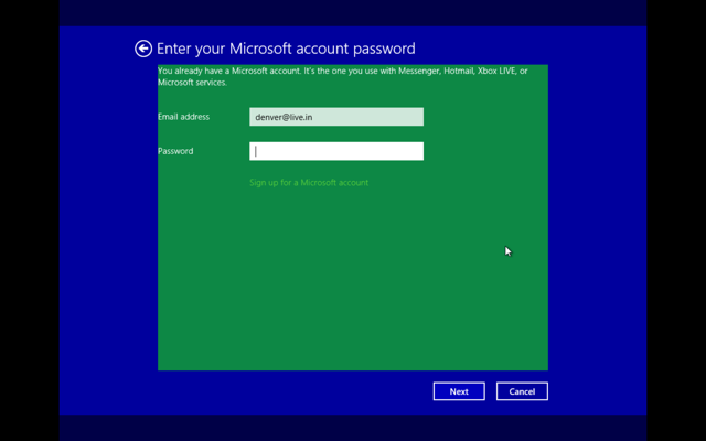
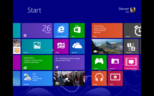
The following few images is for those who haven’t experienced Windows 8. I mean seriously, they had an incredible offer for over 2 months after the release of Windows 8 and you couldn’t spare a few bucks for a life-changing… change?
Now that the installation is done, we can move on to the cool stuff. For the record, the whole thing is happening on a virtual machine on my MacBook Pro with Retina display 15″. It took a total of 5 minutes up to here. What follows is quite a crippled display of Windows 8 which will soon be fixed.
Drivers were installed, and a reboot is in order but first…
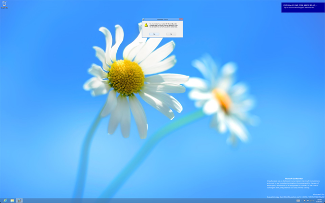
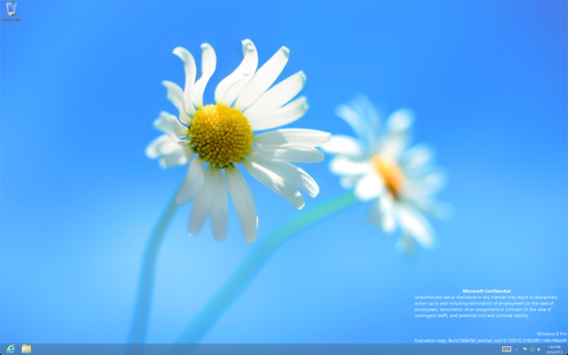
So, we’ve rebooted now and this is what it looks like. There doesn’t seem to be any visual change as of now.
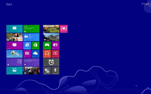
So, let’s do other accessible stuff. For starters, I right clicked randomly.
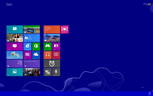
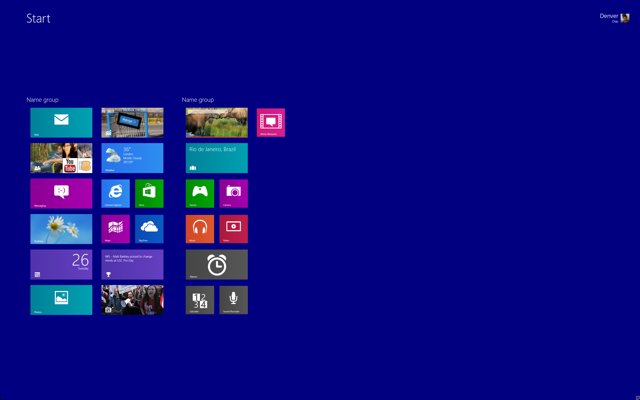
Now is where I started to see change. Customise allows renaming groups of tiles without doing a semantic zoom out. For now, I named the second group of tiles “things”; yeah, totally unoriginal. Then I did a semantic zoom out.
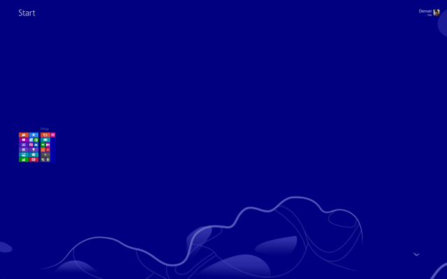
Guess what, right clicking has no effect on zoomed out start screen. It can’t be moved or renamed from there. This essentially means the method of renaming has been replaced. It must be for the best. A lot of people accidentally move their tiles around while attempting to click on it, myself included. Those problems end here.
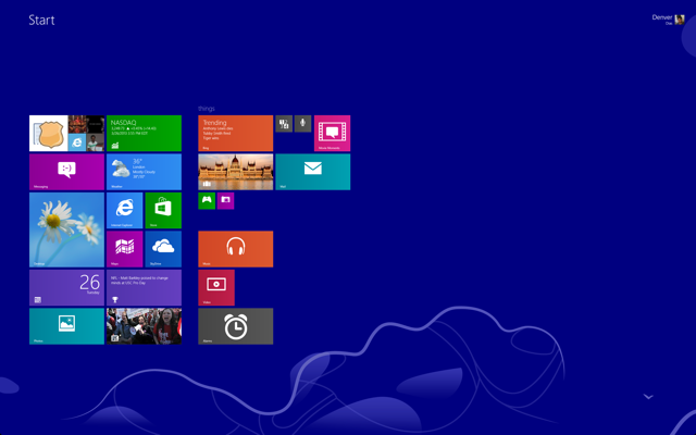
Customise allows to shrink and expand tiles beyond the normal options in Windows 8 that allowed usual and double wide tiles. This is almost the same as Windows Phone in its current stages. There are some unusual things happening here though. The Games and Camera tiles have been shrunk but there is almost an equal gap between them and tiles below. Some work has to be done there – Windows Phone does it perfectly, I’m sure this will too.
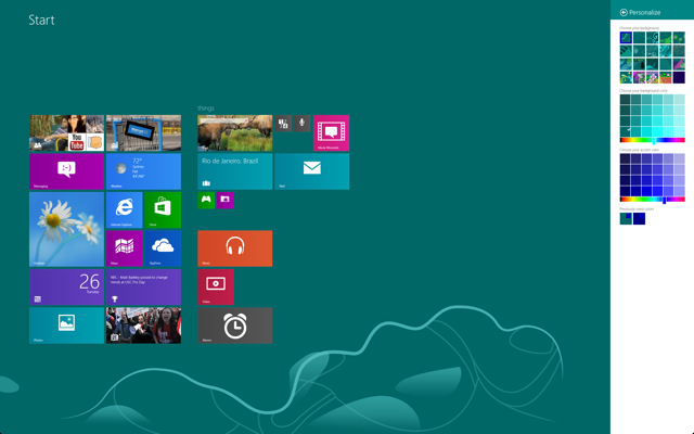
Personalisation can be found in the Settings charm. Finer degree of personalisation is getting more likely here. Speaking of settings, let’s get into the Windows 8 style settings app.
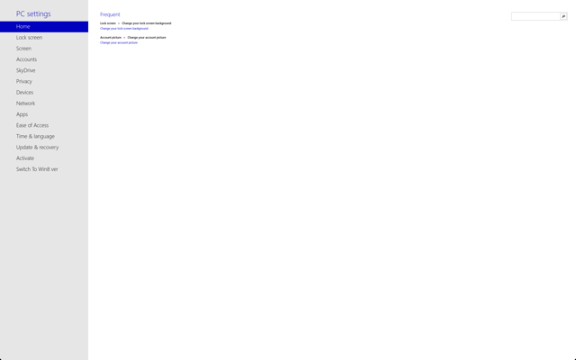
The most frequent setting changes are accessible at the Home tab with the option to search using the search text box. I don’t know why they opted for a dedicated search box when it could be done invoking the search charm, but my guess is it is just for the most frequent changes.
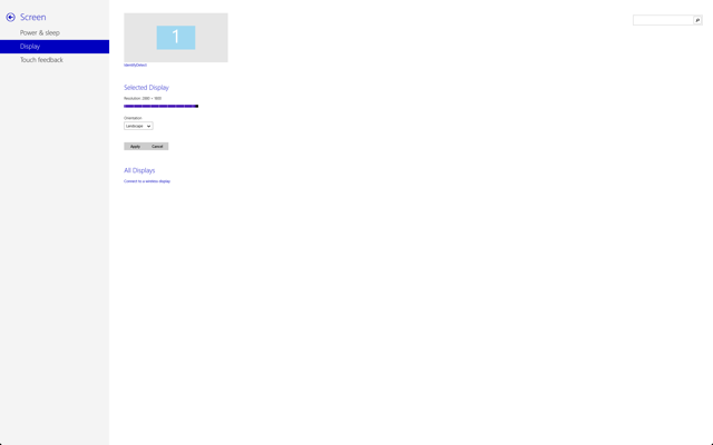
Now, you can change resolutions from within the settings app.
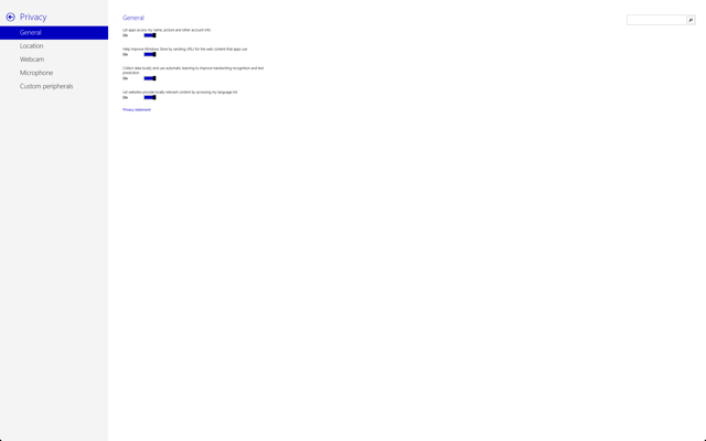
Plus, some things I’ve noticed. The column on the left occupies minimum space for the moment and is not like most menu based apps. Only the innermost tier of options are available at a time.
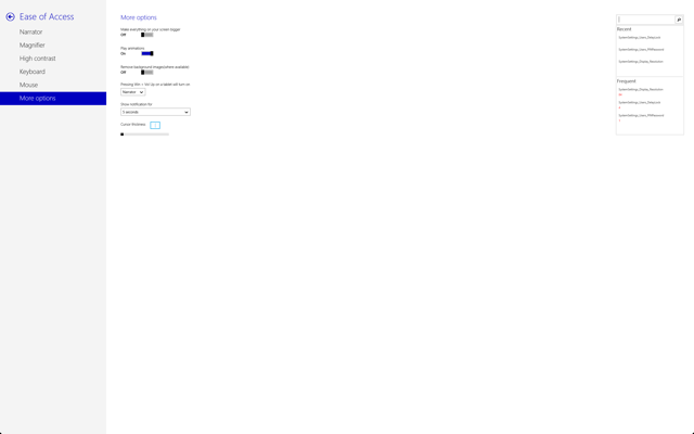
Ease of access in Windows 8 style is a great addition.
You might be interested to note that some of the settings displayed a message saying that the page had not yet been constructed. That includes Activation and Update & Recovery. It is nice to know that activations will be possible from the app itself.
It is clear that Microsoft wishes that we move from the desktop interface to the Windows 8 style apps.
I opened up a few apps and there have not been much discernible changes to them.
Snapping of the apps, however…
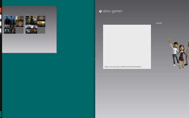
I don’t know for certain if the partially appearing app-bar is a glitch or whether it was intended to serve some purpose – I didn’t seem to make it do anything.
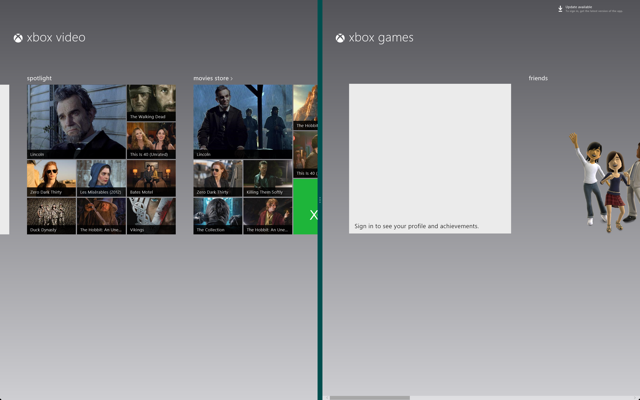
At this point what I was really concerned with is why India is not getting any of the special XBOX video features.
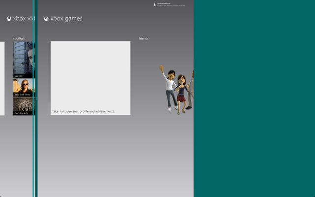
So, it seems the side view is here to stay. I moved the separator left, and it seemed to jump in steps the last one being the one in the shot above. The following is what happens when releasing the left button.
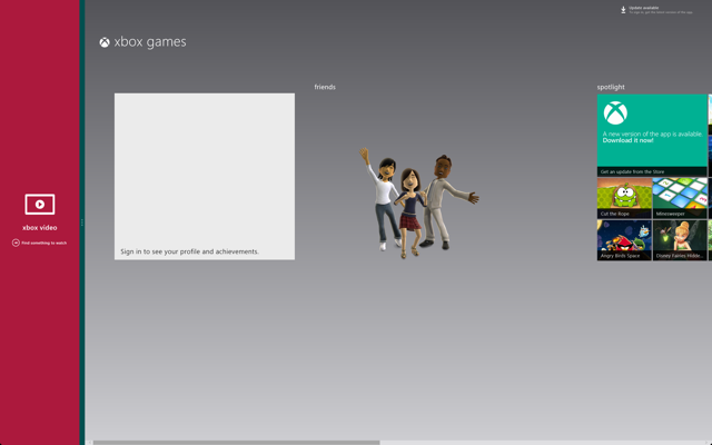
Once you release the mouse button, the side-snapped app changes to its snapped view and the other app acts normally albeit with a little lesser screen real estate.
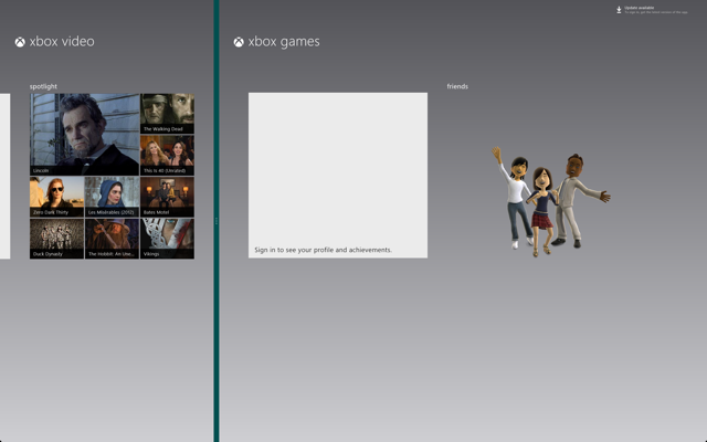
Beside the snapped view and the half view there is virtually every possible view in the middle. Of course, that applies for two side-by-side apps only. The thing that happens next is far more amazing.
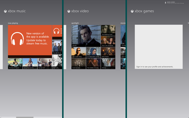
So, there are the three XBOX Entertainment apps snapped side-by-side sharing equal screen space.
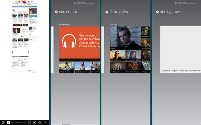
By now I suppose I can safely tell this can go on and on.
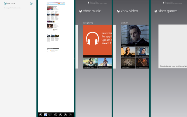
Unfortunately, this is the limit for me. I can’t be quite sure though – it maybe an upper limit imposed for apps. Still, I can rest assured most of you won’t even get here. LOL. I’m actually laughing out loud right now.
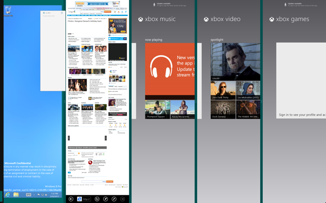
And that’s not all. There is still enough room for all the apps that they don’t immediately get into their snapped view.
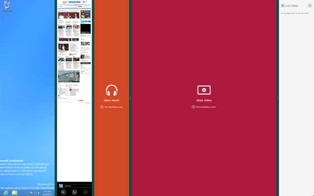
OK! But here is what’s weird. Expanding the video app didn’t automatically make it snap out of snapped view. I juggled around and none of the apps were able to do it well yet.
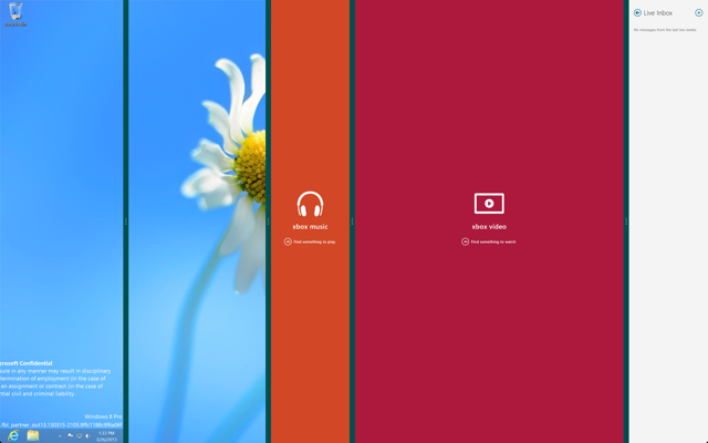
Above, I closed the modern IE app(it’s version 11, by the way). And desktop, instead of expanding did some really weird stuff. Inexplicable for the moment.
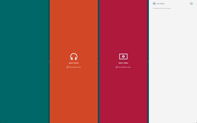
I closed apps individually and they appeared to get out of snapped view when the open app count dropped to 1. From a lot of mousing around, I found that a snapped app needs to be expanded a little more than half the screen to get it out of snapped view – this has to be done taking care that other important open apps don’t snap back. Most optimally usable trick when only two apps are open…
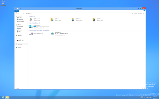
So, Windows 8 is more personal now. Every person can use a Microsoft account to roam their personal settings and no one needs a communal account anymore. The Windows XP style personal folders can come back and they apparently have. Might be an incentive to people refusing to upgrade from XP for this reason.
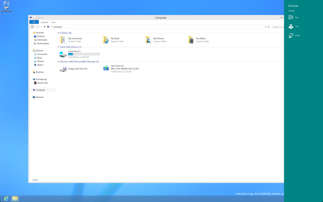
Invoking the Devices charm lets you choose between Play, Print, and Project. Play might quite easily be the option to use “Play To” feature enabled devices in conjunction with your computer, maybe a Wi-Fi enabled TV or a media centre. Print lets you print documents and printable stuff from apps – there is a rumour, it’ll let you print a screenshot if you wish. Project is just plain projection profiles.
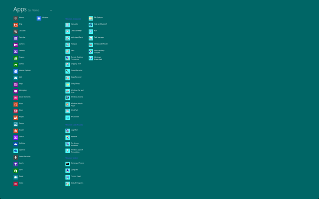
Windows Phone has a Start screen and swiping from right reveals the list of all apps. A similar thing will be a part of Blue. Swiping from bottom – but not from the edge – will reveal an all apps list. This can be simulated with [Win][Q] or by typing a search term in the start screen and it results in the start screen moving upward to make room for the App list. Clicking the Start button displays the reverse effect.
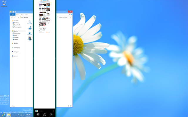
As for some random glitches, I noticed that the IE app got snapped right between the desktop, although the process by which I arrived to this screen is not straightforward. There were three open apps – desktop, IE and, I guess, messenger. I closed the messenger and desktop just filled that space. The open Libraries explorer window is the same one on both ends. The one on the right though is literally inaccessible via the mouse and all movements I made to get that window there is through the left side desktop. That might serve a purpose in the future, but its no good now…
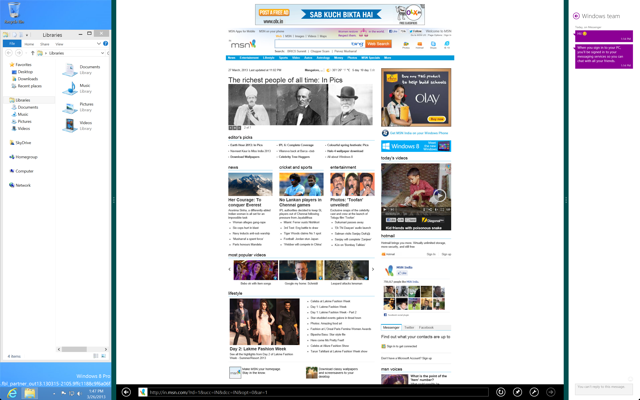
One more thing I noticed. The snapped view for Desktop seems to have disappeared. It does not shrink any more than what I’ve shown above. This is one thing I don’t want to happen. I liked getting a thumbnail view of all my open desktop apps – it’s unacceptable to lose that functionality unless desktop is making a move altogether.
All in all, Blue in its current stages is a pretty impressive achievement and I have high expectations for it.
So, that’s it I guess. Not much can be said on the very first 20 minutes of getting the software at hand. I promise to keep you all updated with the latest in Windows as and when news get to me…
If you like my work, Buy me stuff. Scroll up all the way and click Buy me stuff for more details…
