
Apple has had us in for quite a few surprises, this year at WWDC. Their work in tightly integrating their iOS and Mac OS systems seem to be what the developers looked forward to. Like with Mavericks last year, we're here to discuss our findings about Apple's next Mac OS release - Yosemite. Like we have done many times earlier, again, we're not really authorised to try out the Developer Preview of Yosemite. But we figured, there is always a chance that we'd not be lucky enough to see a tomorrow; better live dangerously. So, my partner in crime and brother, Darryl, found a way for us to experience it right now, before you lot get to try it in the beta program. Oh! Here's a link to sign up for it.
We've never been good enough at reviewing the software feature-wise. We're going by it chronologically. There're are quite a few things they didn't mention in the keynote that we were surprised, pleasantly, to find out ourselves hands on.
Like we have done many times earlier, again, we're not really authorised to try out the Developer Preview of Yosemite. But we figured, there is always a chance that we'd not be lucky enough to see a tomorrow; better live dangerously. So, my partner in crime and brother, Darryl, found a way for us to experience it right now, before you lot get to try it in the beta program. Oh! Here's a link to sign up for it.
We've never been good enough at reviewing the software feature-wise. We're going by it chronologically. There're are quite a few things they didn't mention in the keynote that we were surprised, pleasantly, to find out ourselves hands on.
The Desktop
[caption id="attachment_2235" align="aligncenter" width="640"]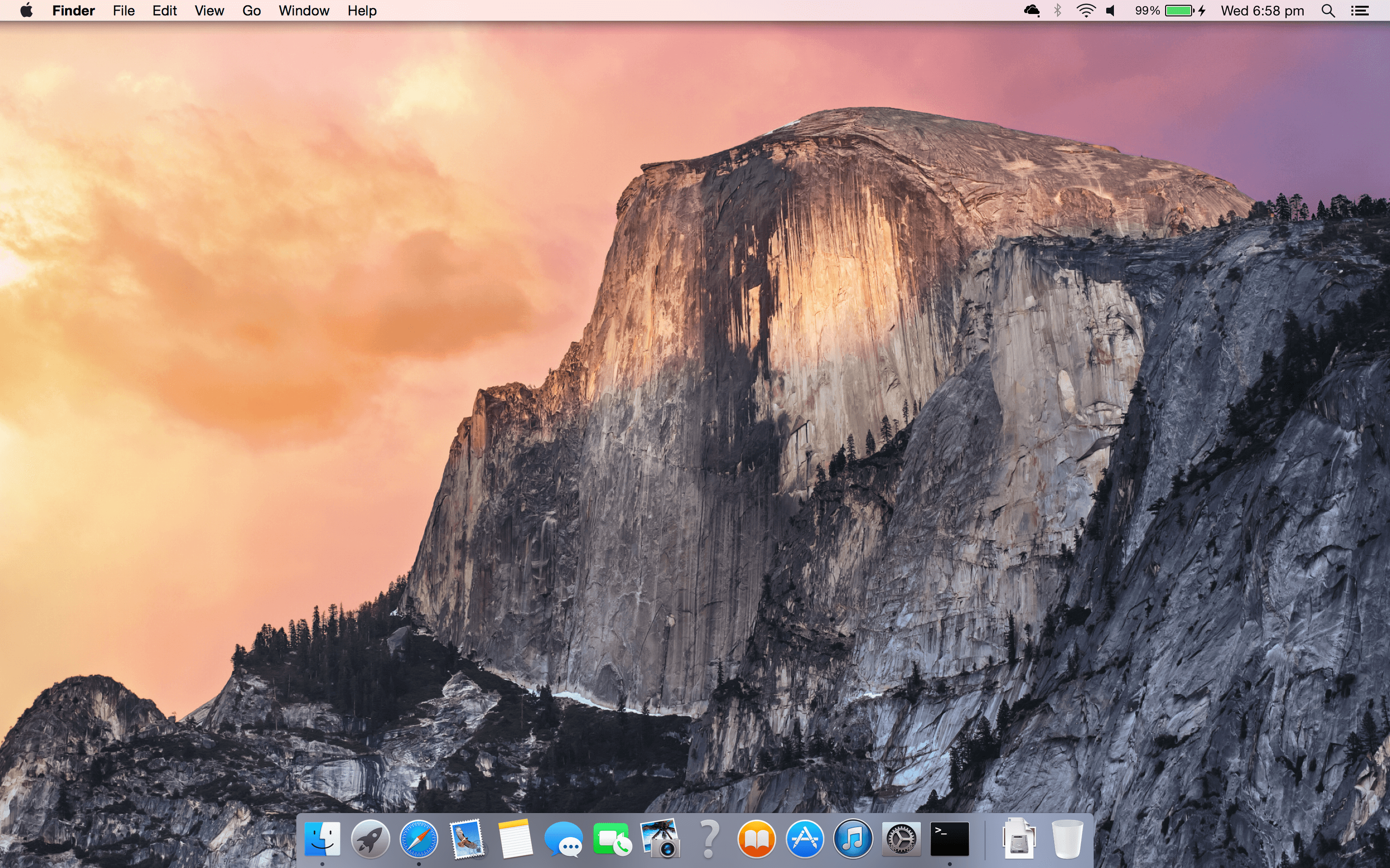 I would've never expected this to surpass the fluidity of Mavericks. But it does...[/caption]
First of all, can we just take a moment to think how Apple actually managed to prevent any leaks that might hint people the name of this beautiful release - Yosemite - when they cannot otherwise seem to do it well with literally everything else.
That desktop is too gorgeous to describe in words. The translucent menu bar and Dock are reminiscent of iOS' recent revamp in its 7th iteration. The icons for many of the apps have been updated to be as minimalistic as possible and yet intensely descriptive of their functions.
That question mark seems odd though. Is that a new app I need to know about?
[caption id="attachment_2237" align="aligncenter" width="640"]
I would've never expected this to surpass the fluidity of Mavericks. But it does...[/caption]
First of all, can we just take a moment to think how Apple actually managed to prevent any leaks that might hint people the name of this beautiful release - Yosemite - when they cannot otherwise seem to do it well with literally everything else.
That desktop is too gorgeous to describe in words. The translucent menu bar and Dock are reminiscent of iOS' recent revamp in its 7th iteration. The icons for many of the apps have been updated to be as minimalistic as possible and yet intensely descriptive of their functions.
That question mark seems odd though. Is that a new app I need to know about?
[caption id="attachment_2237" align="aligncenter" width="640"]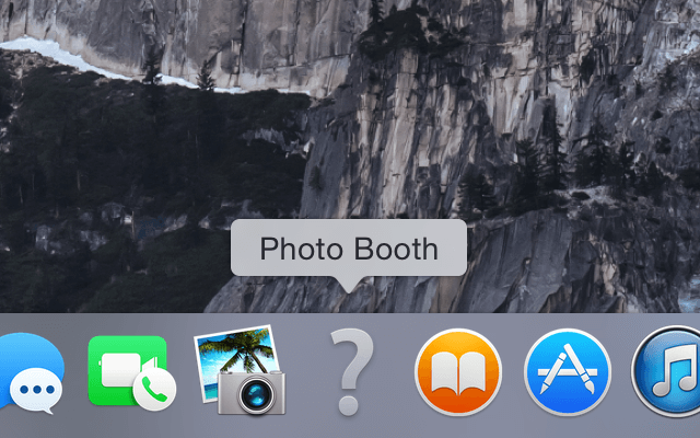 So, it looks like we might have to part with a few apps when we make the upgrade. They might change their mind about it.[/caption]
So, let's check out the Applications folder for all the apps that won't work with the system.
So, it looks like we might have to part with a few apps when we make the upgrade. They might change their mind about it.[/caption]
So, let's check out the Applications folder for all the apps that won't work with the system.
Finder
[caption id="attachment_2238" align="aligncenter" width="640"]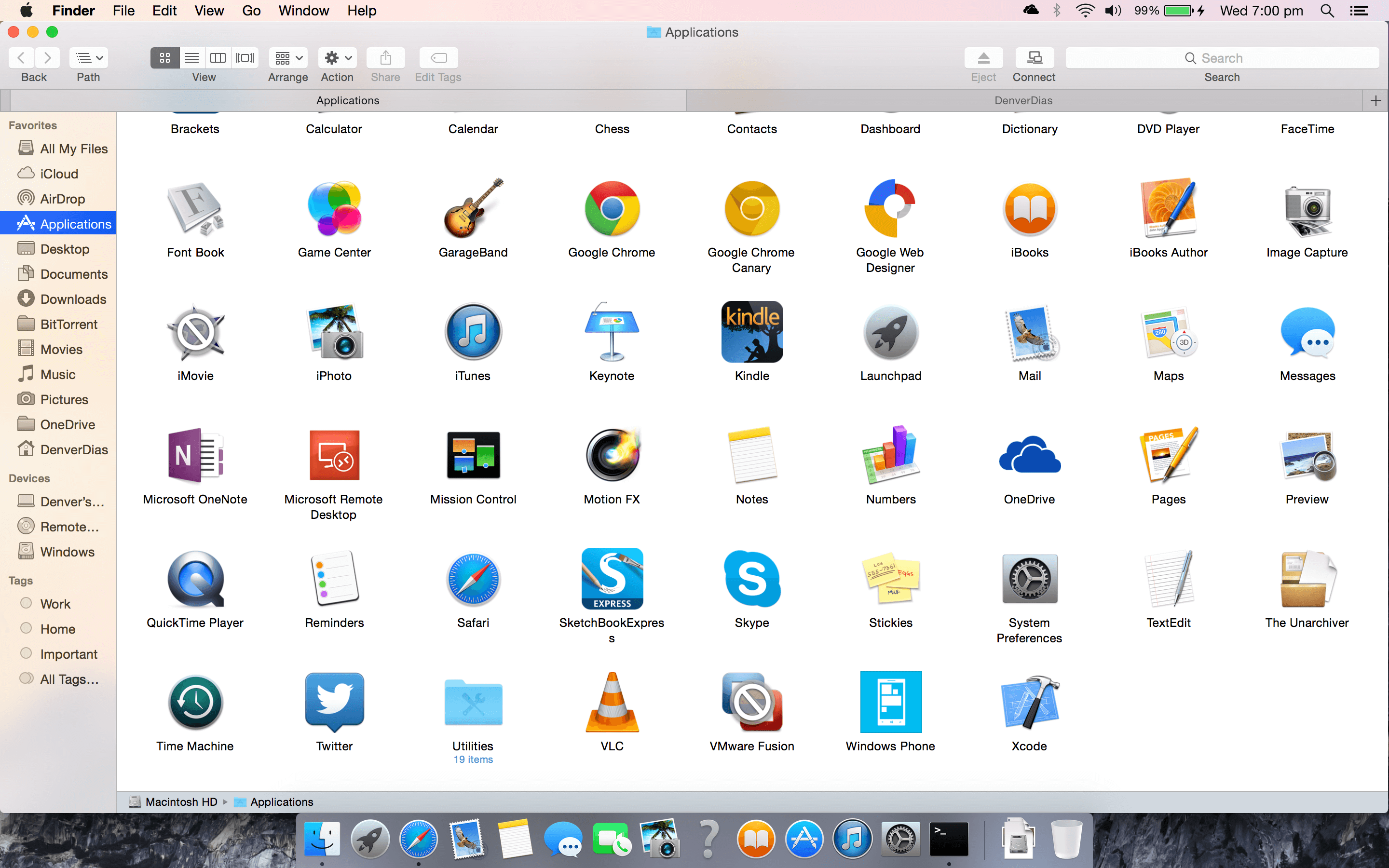 Hmm, so I didn't think that through. I have no idea what apps are missing because I didn't make a note of it earlier.[/caption]
It seems that iMovie by Apple would have to be upgraded to work with Yosemite. As for apps not made by Apple themselves, there's VMware Fusion that will have to follow suit. Photo Booth, on the other hand, seems to be removed completely. I reckon they might include its features in the grounds-up build of Photos for Mac OS they've promised us.
So, that's that. I happened to notice the absence of the full-screen button on the top right. Does it mean Finder will no longer be a full screen app? That's OK I guess. Let me just restore Finder to the not so screen space consuming size and...
[caption id="attachment_2240" align="aligncenter" width="640"]
Hmm, so I didn't think that through. I have no idea what apps are missing because I didn't make a note of it earlier.[/caption]
It seems that iMovie by Apple would have to be upgraded to work with Yosemite. As for apps not made by Apple themselves, there's VMware Fusion that will have to follow suit. Photo Booth, on the other hand, seems to be removed completely. I reckon they might include its features in the grounds-up build of Photos for Mac OS they've promised us.
So, that's that. I happened to notice the absence of the full-screen button on the top right. Does it mean Finder will no longer be a full screen app? That's OK I guess. Let me just restore Finder to the not so screen space consuming size and...
[caption id="attachment_2240" align="aligncenter" width="640"]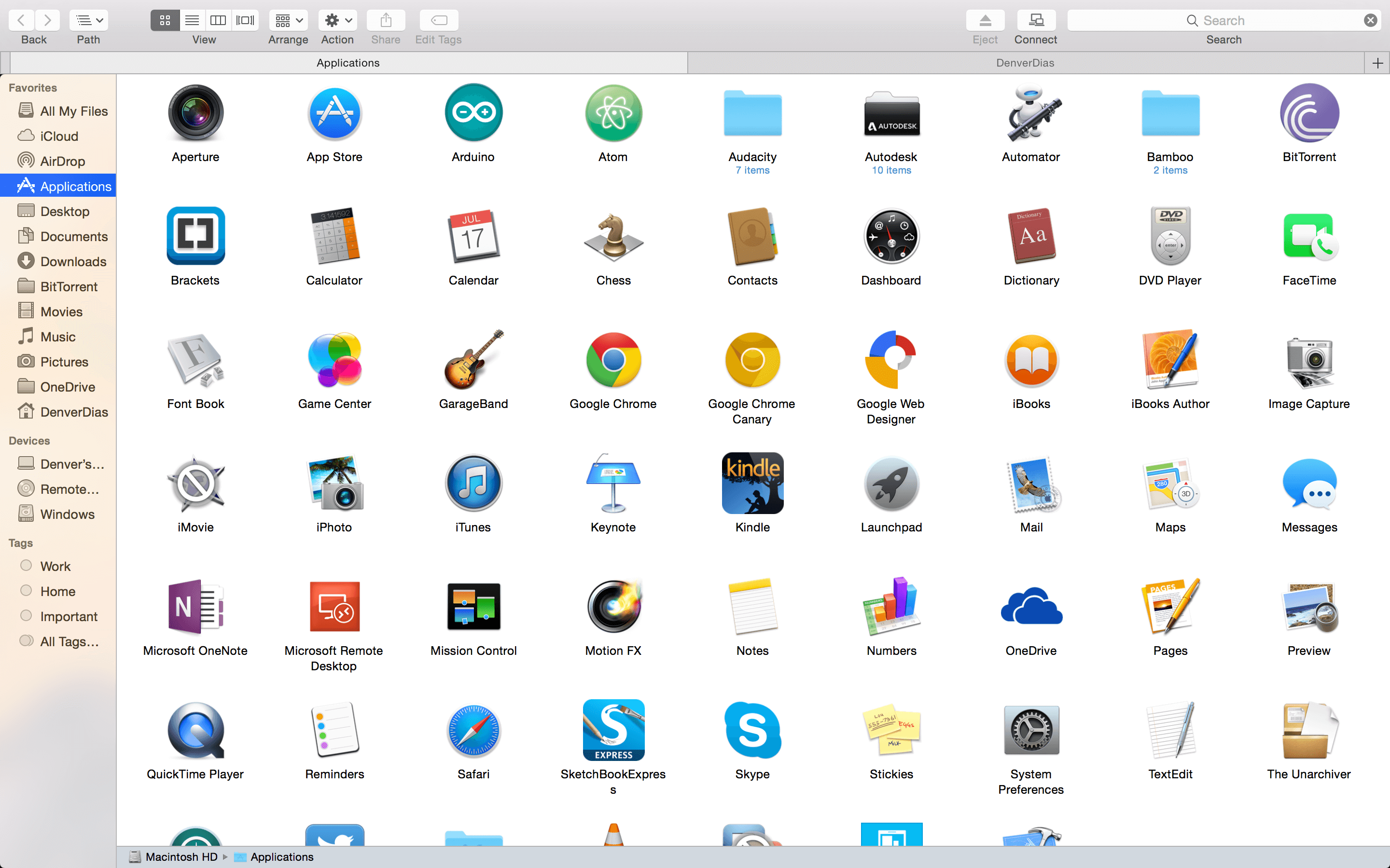 OK! So, it went full screen. The kind of full screen I expected to have vanished from the OS...[/caption]
Let's see what happens when we have a lot of tabs.
[video width="640" height="400" autoplay="on" loop="on" preload="on" m4v="https://revryl.com/wp-content/uploads/2014/06/TabSwipe.m4v"][/video]
So, we have the ability, now, to simply swipe through tabs instead of having to click through a drop-down.
[caption id="attachment_2239" align="aligncenter" width="640"]
OK! So, it went full screen. The kind of full screen I expected to have vanished from the OS...[/caption]
Let's see what happens when we have a lot of tabs.
[video width="640" height="400" autoplay="on" loop="on" preload="on" m4v="https://revryl.com/wp-content/uploads/2014/06/TabSwipe.m4v"][/video]
So, we have the ability, now, to simply swipe through tabs instead of having to click through a drop-down.
[caption id="attachment_2239" align="aligncenter" width="640"]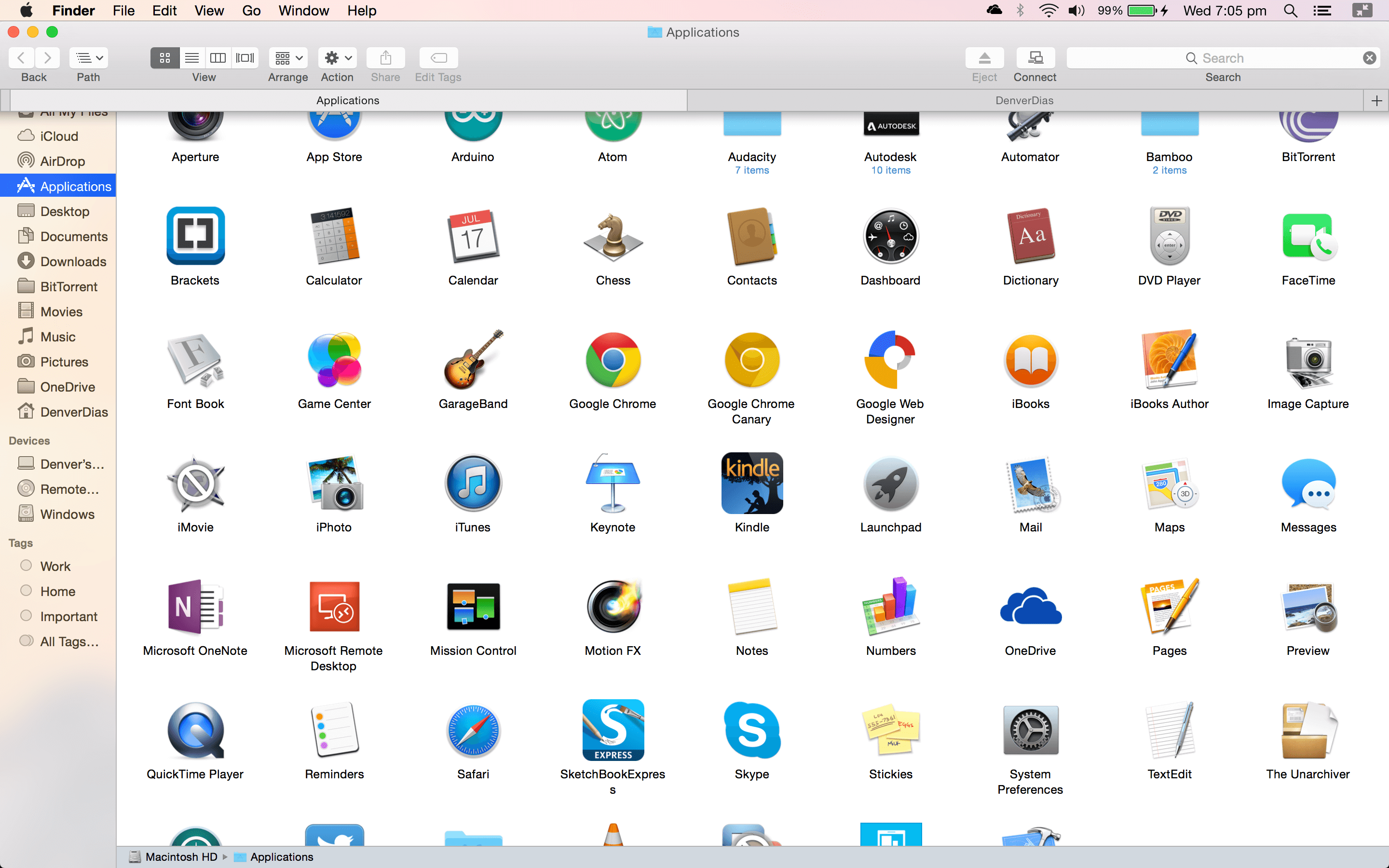 If you drop down the menubar, you'll now be able to see the Close, Minimise and Restore buttons. The minimise button shouldn't work, and it doesn't. Finder is the only app that shows it as a clickable button but it greys out if you switch between full screen apps and then invoke the menu. Safari greys it out immediately...[/caption]
I suppose that was enough Finder for today. Let's check out Safari.
If you drop down the menubar, you'll now be able to see the Close, Minimise and Restore buttons. The minimise button shouldn't work, and it doesn't. Finder is the only app that shows it as a clickable button but it greys out if you switch between full screen apps and then invoke the menu. Safari greys it out immediately...[/caption]
I suppose that was enough Finder for today. Let's check out Safari.
Safari
[caption id="attachment_2247" align="aligncenter" width="640"]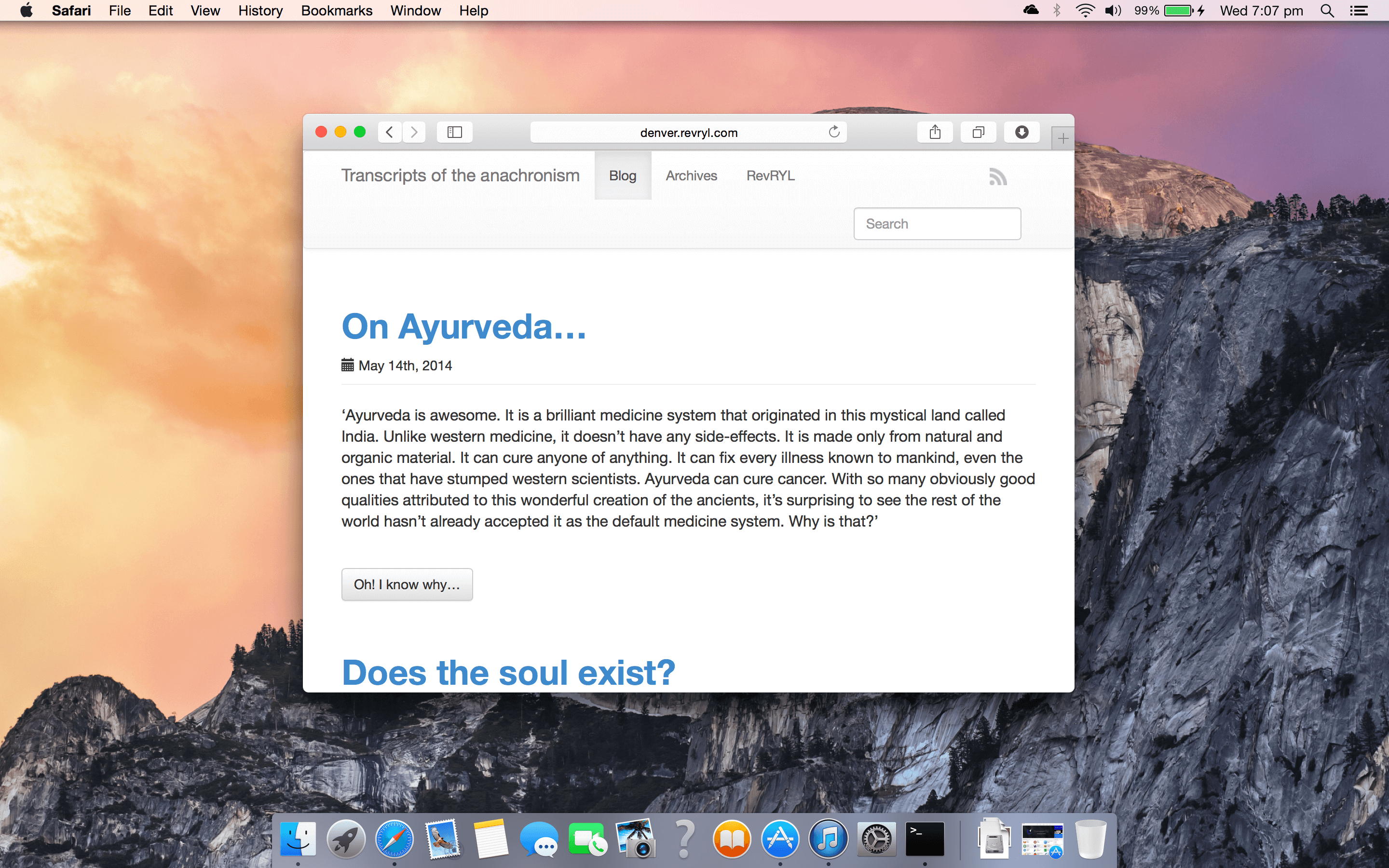 Wow! I've got to correct my blog's appearance. That's just nasty.[/caption]
So, that's pretty neat. The ribbon above the browsing area barely takes up any space. I'm loving it. But let's widen it a bit.
[caption id="attachment_2248" align="aligncenter" width="640"]
Wow! I've got to correct my blog's appearance. That's just nasty.[/caption]
So, that's pretty neat. The ribbon above the browsing area barely takes up any space. I'm loving it. But let's widen it a bit.
[caption id="attachment_2248" align="aligncenter" width="640"]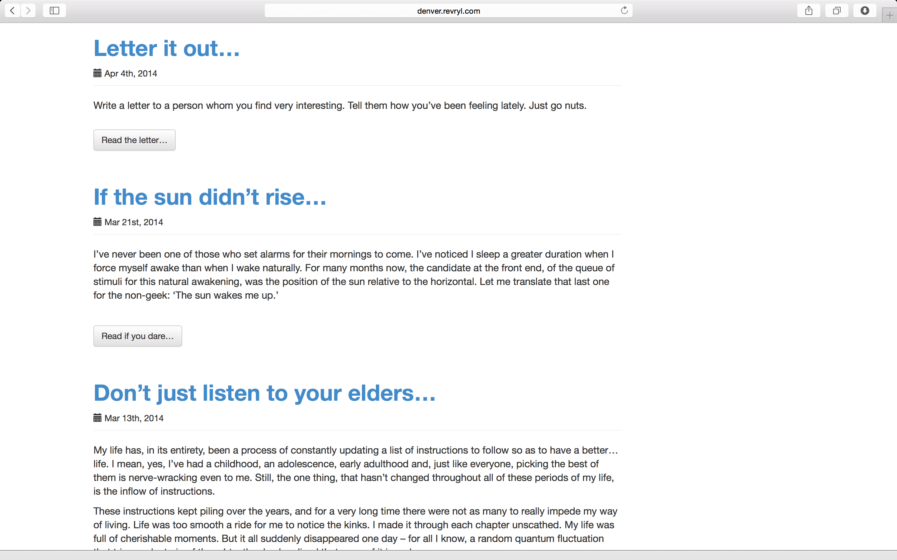 This just keeps getting better. I don't really care about the transparency effects but that's the most browsing space one can expect with visible usable controls.[/caption]
Here's what you'd get if you moved to a non-root page on the site. The address bar only describes the site itself and not the entire URL.
[caption id="attachment_2249" align="aligncenter" width="640"]
This just keeps getting better. I don't really care about the transparency effects but that's the most browsing space one can expect with visible usable controls.[/caption]
Here's what you'd get if you moved to a non-root page on the site. The address bar only describes the site itself and not the entire URL.
[caption id="attachment_2249" align="aligncenter" width="640"]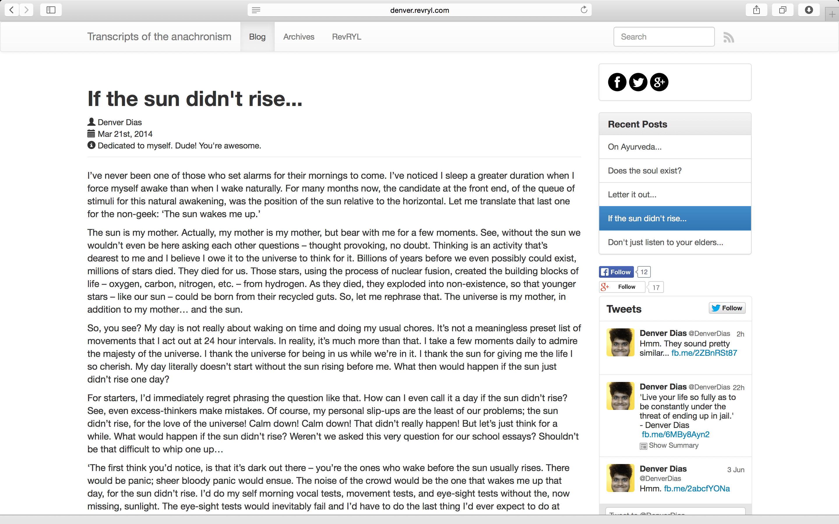 It is almost the same as it does on iOS devices.[/caption]
Of course, that does not mean you can never access the URL. It is just a click away.
[caption id="attachment_2250" align="aligncenter" width="640"]
It is almost the same as it does on iOS devices.[/caption]
Of course, that does not mean you can never access the URL. It is just a click away.
[caption id="attachment_2250" align="aligncenter" width="640"]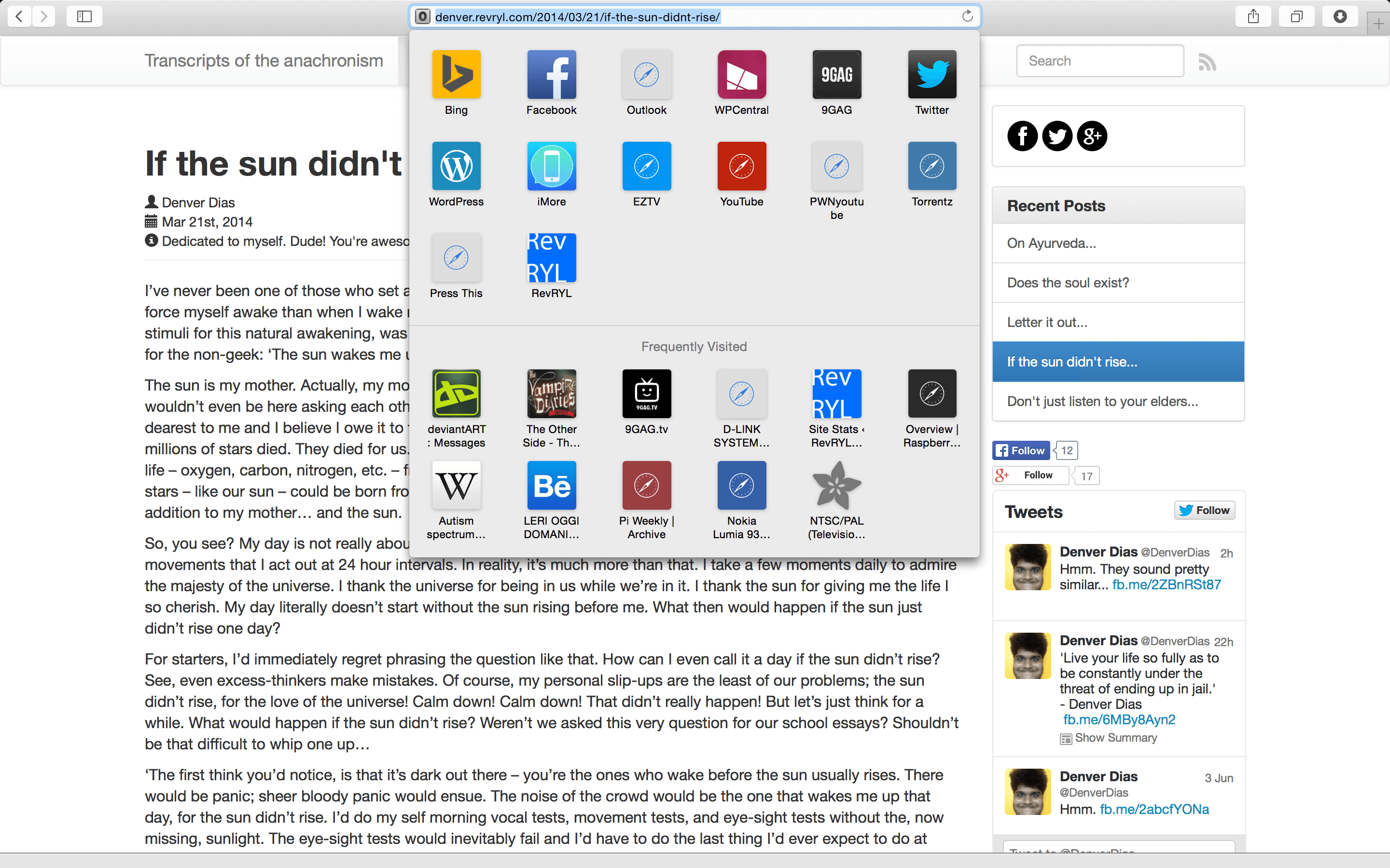 So, I admit it. I have a weird set of interests.[/caption]
Of course, in Yosemite, Safari has got much better at gesture handling. They aren't very much different except it's speedier now than in Mavericks. Let's zoom out beyond the normal page size and see what happens.
[caption id="attachment_2251" align="aligncenter" width="640"]
So, I admit it. I have a weird set of interests.[/caption]
Of course, in Yosemite, Safari has got much better at gesture handling. They aren't very much different except it's speedier now than in Mavericks. Let's zoom out beyond the normal page size and see what happens.
[caption id="attachment_2251" align="aligncenter" width="640"]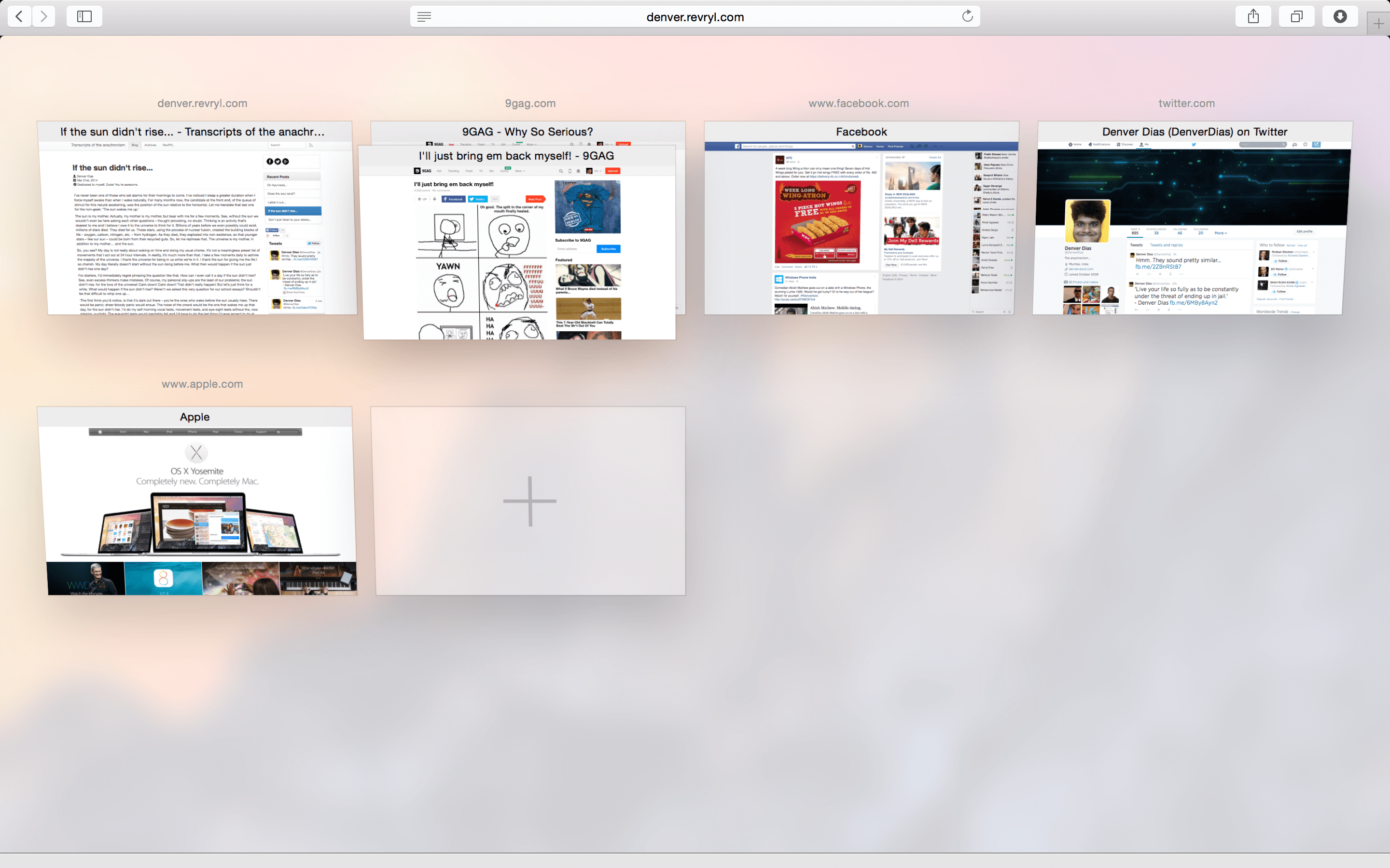 Believe me. This isn't a tenth of what I browse normally. I'm not a narcissist.[/caption]
Now, let's load up the desktop with a few apps, so that we can try Mission Control. They didn't talk much about it. It's got to be worth something better.
Believe me. This isn't a tenth of what I browse normally. I'm not a narcissist.[/caption]
Now, let's load up the desktop with a few apps, so that we can try Mission Control. They didn't talk much about it. It's got to be worth something better.
Mission Control
So, I started up iBooks and set it to display the autobiography of Charles Darwin and iPhoto to quench my thirst to marvel at my face all the time.
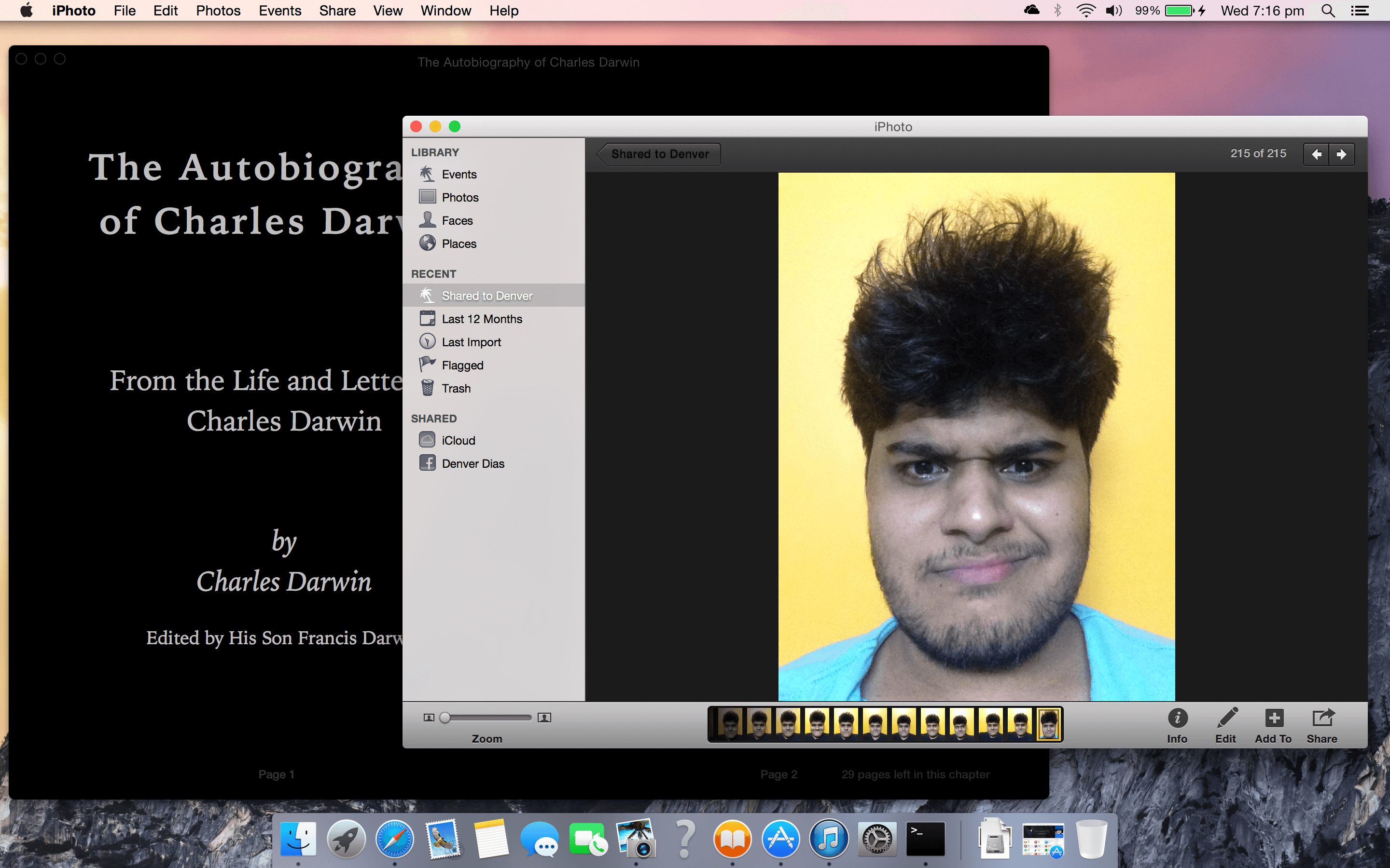 Hmm. Time to make a four finger swipe up and... Wow!
[caption id="attachment_2253" align="aligncenter" width="640"]
Hmm. Time to make a four finger swipe up and... Wow!
[caption id="attachment_2253" align="aligncenter" width="640"]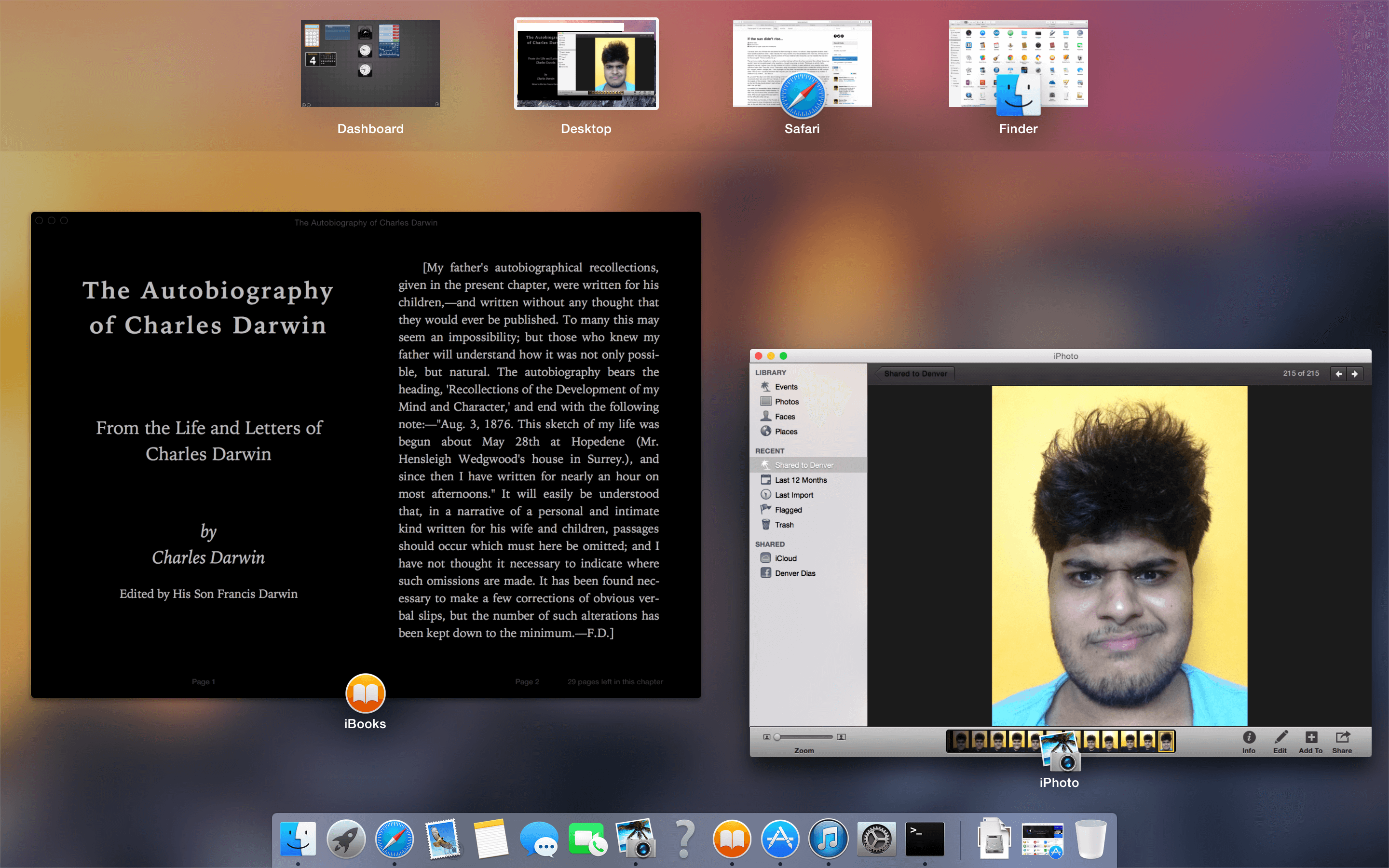 So, here we have a consistent translucency experience. Goes perfectly with the rest of the UI.[/caption]
There's no Desktop overlaid on a grey background anymore. Mission Control now has your apps floating so as to get your desktop background out of focus. Let's see how it handles the full screen apps.
So, here we have a consistent translucency experience. Goes perfectly with the rest of the UI.[/caption]
There's no Desktop overlaid on a grey background anymore. Mission Control now has your apps floating so as to get your desktop background out of focus. Let's see how it handles the full screen apps.
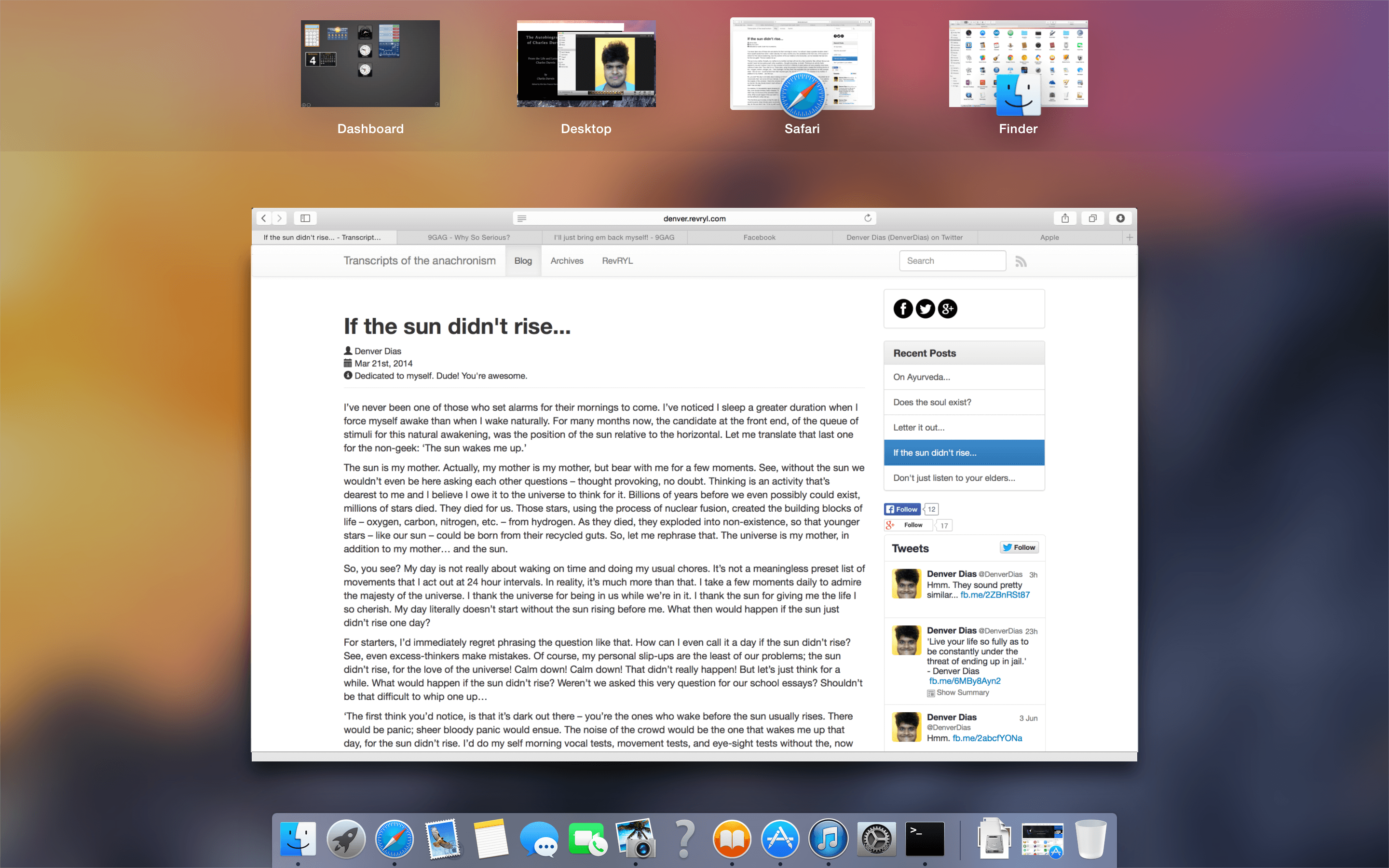
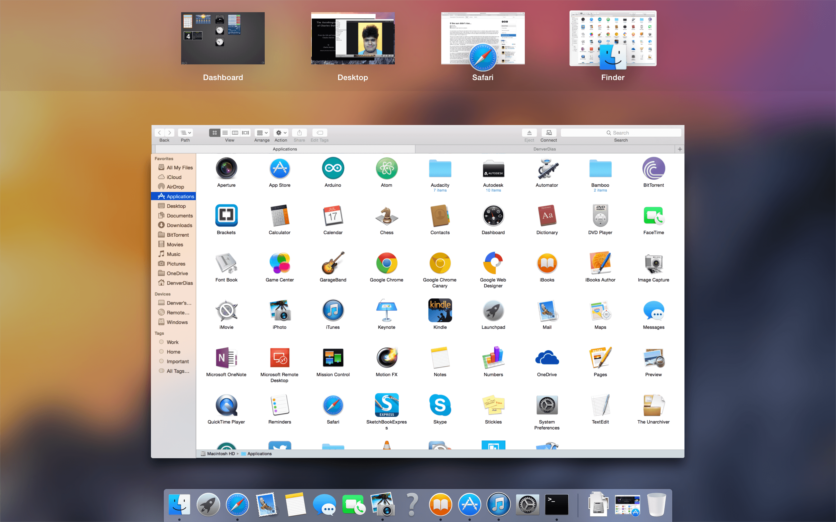 Yeah! That's a nice way to do it. I couldn't think of a much better presentation. Let's go all the way to the Dashboard and see how that works.
[caption id="attachment_2256" align="aligncenter" width="640"]
Yeah! That's a nice way to do it. I couldn't think of a much better presentation. Let's go all the way to the Dashboard and see how that works.
[caption id="attachment_2256" align="aligncenter" width="640"]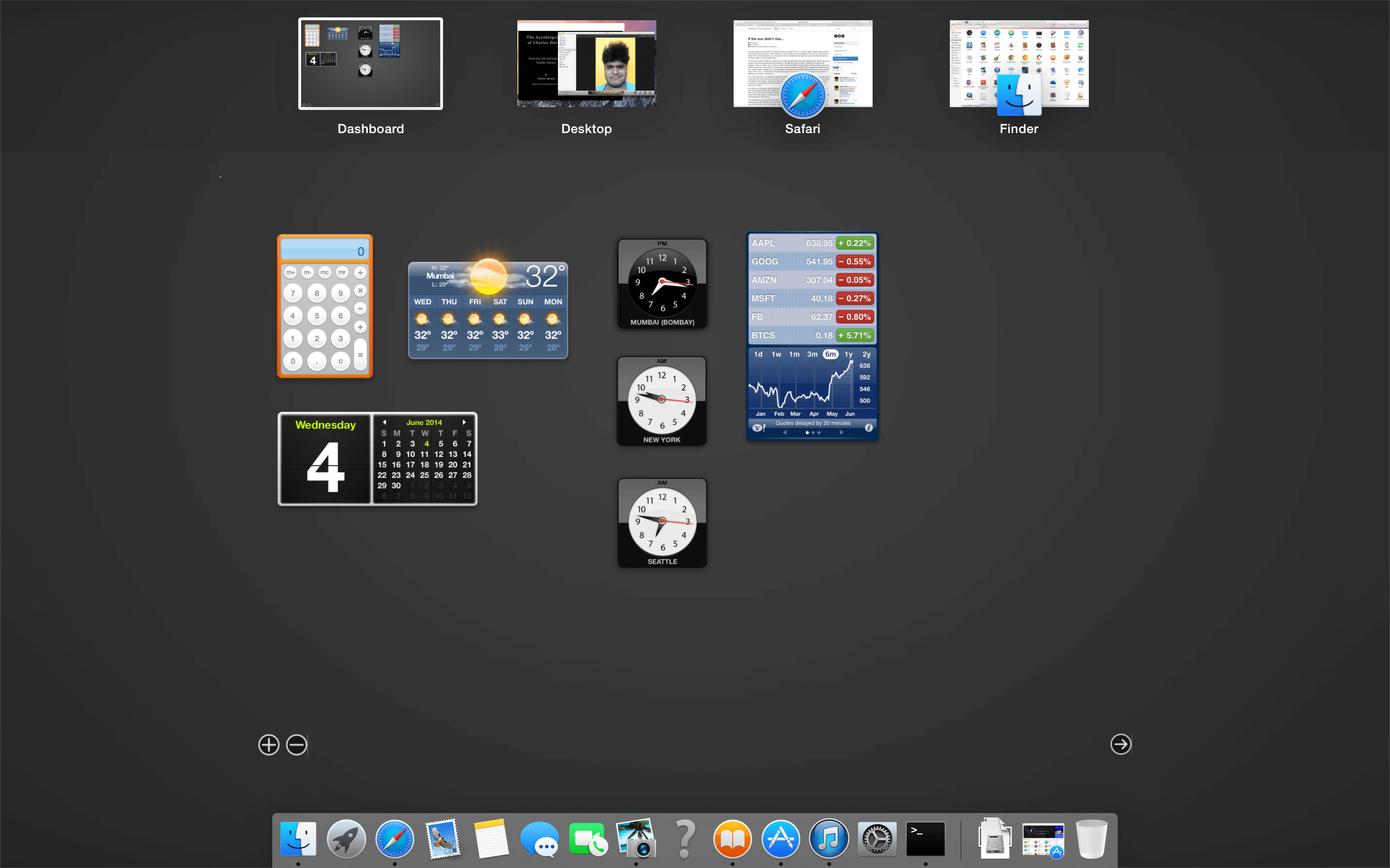 Yes. Again, couldn't ask for a better presentation. The dashboard would just look too weird with an out of focus vibrant wallpaper behind it.[/caption]
Now let's get back to the Desktop and take a look at the new Notification Centre.
Yes. Again, couldn't ask for a better presentation. The dashboard would just look too weird with an out of focus vibrant wallpaper behind it.[/caption]
Now let's get back to the Desktop and take a look at the new Notification Centre.
Notification Center
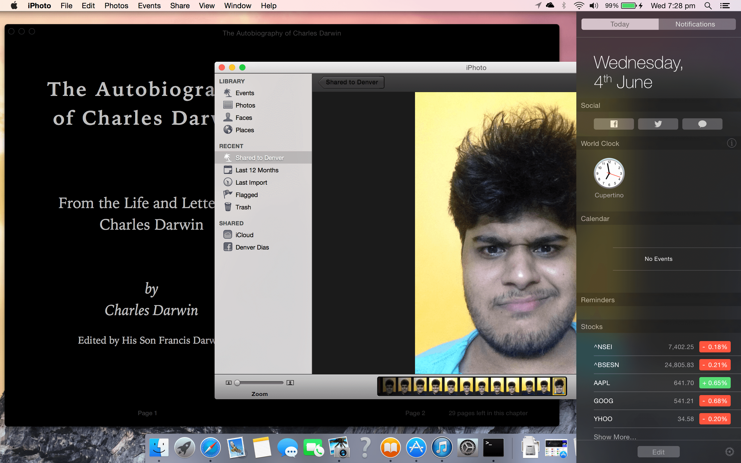 In Yosemite, Notification Center does not slide your whole desktop to the side. Instead, it translucently overlays. The same works with full-screen apps too.
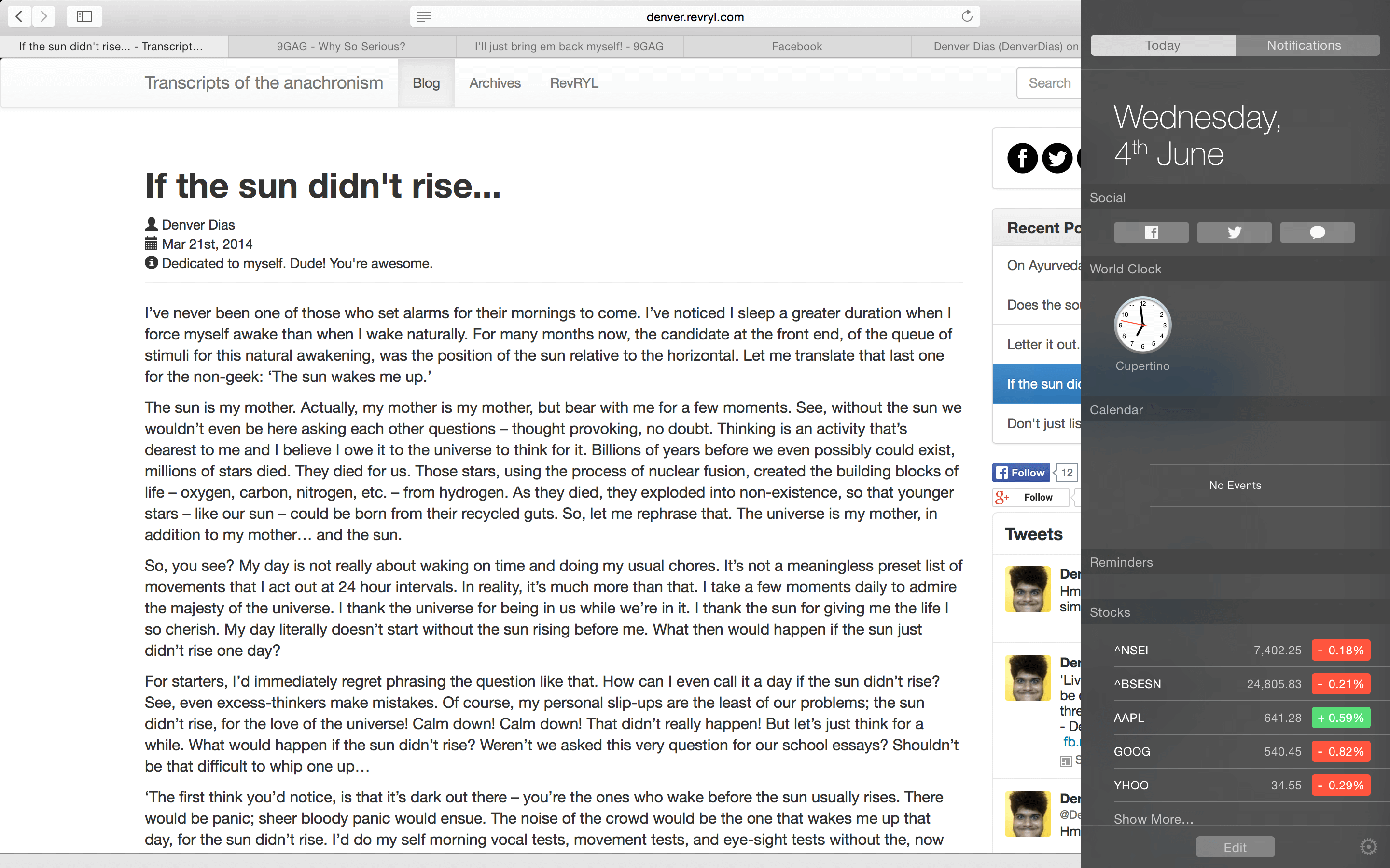 Great! Now let's have a look at iTunes and how it fares with it's translucency.
iTunes
As it turns out, iTunes, on our install at least, doesn't seem to have updated. It is very likely that iTunes is an app unlike any other and all of it's UI elements are completely distinct to every other generic app.
[caption id="attachment_2259" align="aligncenter" width="640"]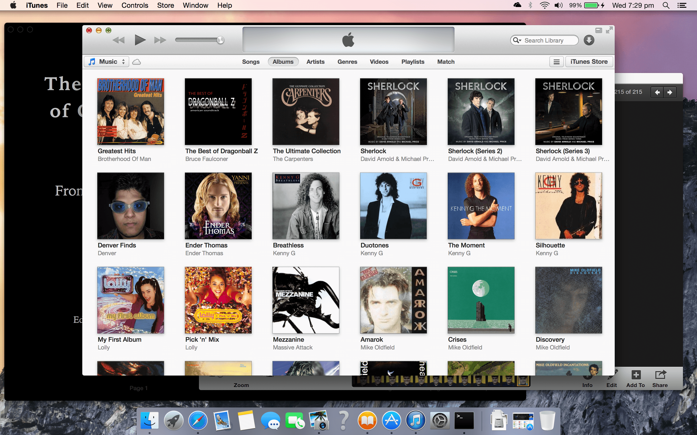 Notice the still old Close, Minimise, Maximise buttons and the not-at-all-translucent UI.[/caption]
Clicking the Maximise button here doesn't take it full-screen. It instead just takes up maximum space available on the desktop like it always does. The full-screen switch still exists on iTunes and that takes it full-screen, with somewhat disastrous results.
[caption id="attachment_2260" align="aligncenter" width="640"]
Notice the still old Close, Minimise, Maximise buttons and the not-at-all-translucent UI.[/caption]
Clicking the Maximise button here doesn't take it full-screen. It instead just takes up maximum space available on the desktop like it always does. The full-screen switch still exists on iTunes and that takes it full-screen, with somewhat disastrous results.
[caption id="attachment_2260" align="aligncenter" width="640"]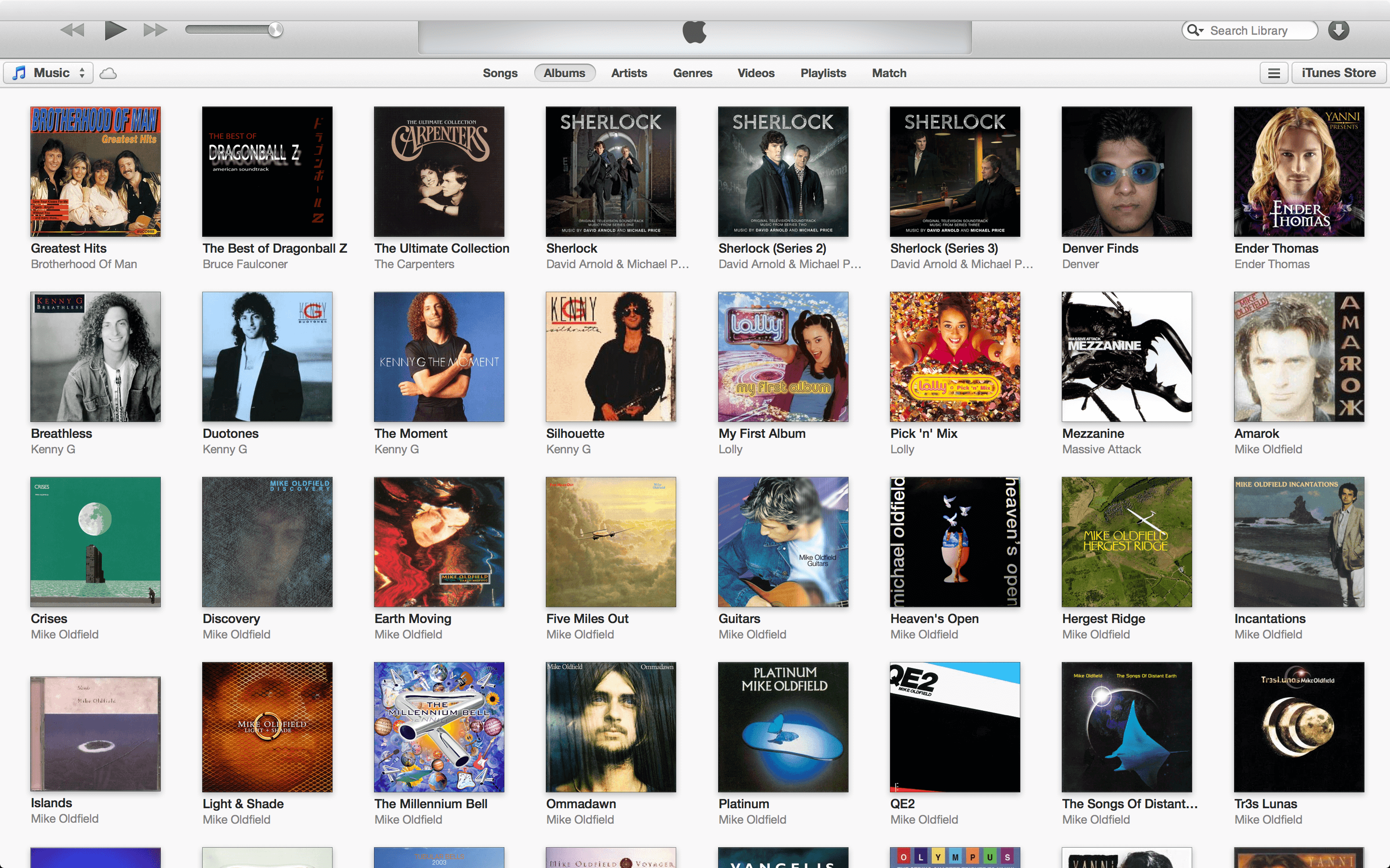 Not that big of a deal. It is still the same iTunes if not a regressed version of it, but there's a blank bar overlaying the iTunes control ribbon. The menu drops down there but the bar doesn't vanish...[/caption]
Yosemite app icons
The app icons for many of the built in apps have been made much more elegant.
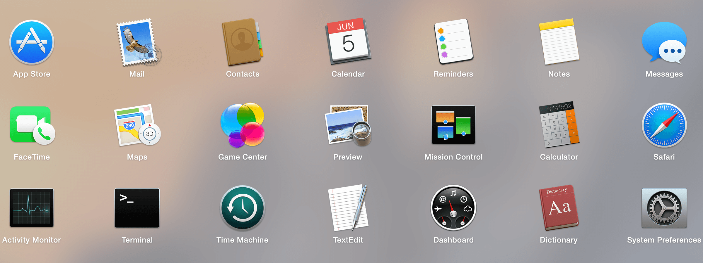 It is now, pretty clear from just glancing at the icons what they're supposed to do. The Calculator app icon makes a subtle reference to $latex \pi$.
Oh! And check out the new logo of Game Center. It looks like they've finally taken it easy with the skeuomorphic layout to make it more consistent with every other app (except perhaps iPhoto, which might be going away soon).
It is now, pretty clear from just glancing at the icons what they're supposed to do. The Calculator app icon makes a subtle reference to $latex \pi$.
Oh! And check out the new logo of Game Center. It looks like they've finally taken it easy with the skeuomorphic layout to make it more consistent with every other app (except perhaps iPhoto, which might be going away soon).
Game Center
[caption id="attachment_2264" align="aligncenter" width="640"]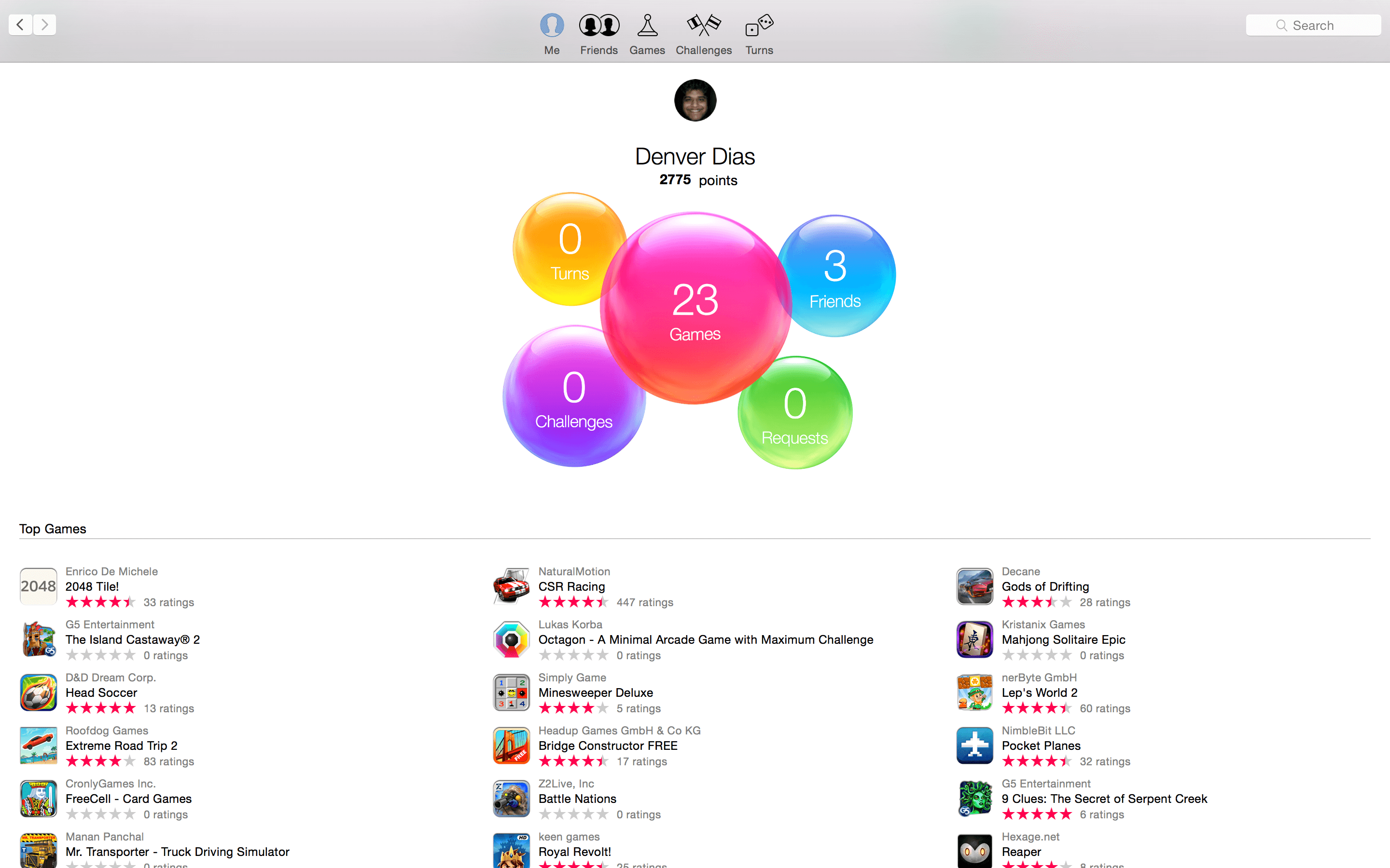 Yes, indeed they have run out of green baize and wood. Game Center is now as pleasant to the eye as it is on iOS.[/caption]
Let's not go into further detail. Letting you all know I've got three friends is enough.
Hmm, so pretty much everything has changed itself to more closely resemble iOS. Perhaps Launchpad folders behave that way too.
Yes, indeed they have run out of green baize and wood. Game Center is now as pleasant to the eye as it is on iOS.[/caption]
Let's not go into further detail. Letting you all know I've got three friends is enough.
Hmm, so pretty much everything has changed itself to more closely resemble iOS. Perhaps Launchpad folders behave that way too.
Launchpad
Oh yes! Indeed, they do. The folders are now, no longer a drop-down. In Yosemite, launchpad folders expands just they way it does with iOS. [video width="640" height="400" autoplay="on" loop="on" preload="on" m4v="https://revryl.com/wp-content/uploads/2014/06/LaunchpadFolder.m4v"][/video]
Maximisation and full-screen on Yosemite
Apps that are capable of going full-screen now no longer show the full-screen button. Rather, the maximise button itself is the full-screen switch.
 Some apps, like FaceTime and Twitter's own client, cannot go full screen thus, it will show you a different switch for maximisation.
 So, what do you do in Yosemite, if you just want to maximise a full-screen capable app? Is there a way to do that?
Sure, there is. You just have to simply double click in the vicinity of the titlebar of any app and it will maximise instead of going full-screen.
So, what do you do in Yosemite, if you just want to maximise a full-screen capable app? Is there a way to do that?
Sure, there is. You just have to simply double click in the vicinity of the titlebar of any app and it will maximise instead of going full-screen.
Final words
Sincerely, Yosemite has been a delight. Of course, there are some kinks scattered all over the place but we're hopeful they'll all be found and fixed before the final release which, by the way, is free. We've certainly got more to discuss about Yosemite, but you'll have to wait a while, of course. Do leave us some feedback via comments. If there's something we could help you out with, you know we will.